On this page are three types of existing media that cover the horror genre, magazine, posters and trailers. Each category has three different examples which analyses their conventions and mise-en-scene.
Horror Magazines
Mise-en-Scene
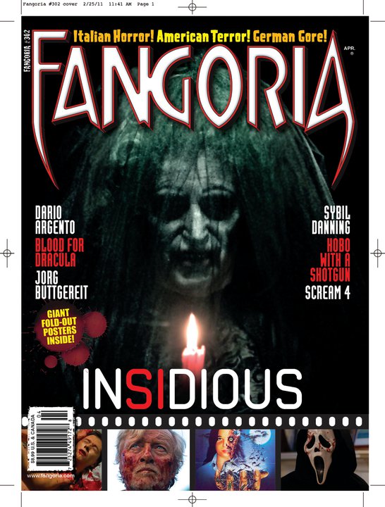
The use of lighting in the image is coming from the candle which reveals the face of what seems to be a deceased woman in a wedding dress.
There is no distinct setting visible from the image as it is a mid-close up shot, and accompanied by the use of lighting, the rest of the space is dark so the setting is unknown.
The composition of the image is so that the person and the candle are at the centre, allow the image to be symmetrical. This symmetry allows the magazine to revolve around it, so there are cover-lines on both sides of the page. It keeps both sides even, having two movies and one person on the right side, and two people and one movie on the left side.
Magazine Conventions
The magazine uses Sans Serif type fonts in order to maintain its modern era feeling. It also goes well with the font used for the title of the movie allowing both magazine and movie title to complement each other.
The masthead of the magazine uses its own font-style which allows it to have the look of having fangs on the first and last letter on the masthead which uses wordplay between the word fangs and euphoria, so it essentially aims to create excitement for horror, and as fangs are famous in the horror scene by vampires sucking blood, the tips of the fangs are outlined in red connoting blood and lust.
The colour scheme of the front cover strays away from the colour scheme used in the image but remain relevant to the actual title of the movie. This creates a complimentary-contrast between image and font which makes it seem different from each other, but also stay on the same topic. It also allows the cover-lines to be easily seen.
The selling line of the magazine is sharp and simple, quickly letting the audience know what type of content they cover; “Italian Horror!, American Terror!, German Gore!”.
The other images in the magazine front page relates to the other cover-lines but without any direct reference. This means that the magazine is specifically made for those who know the genre and the films with it. Furthermore, as it is a horror film magazine, it brings reference to the roots of film by having the smaller images in a film reel to give it that old school look.
The left third of the magazine stays iconic and persuasive. It contains the first two letters of the masthead which is the first and last letter, so readers will know its that magazine without having seen the whole front page. It also puts the “free stuff” button on the left third to make it more eye catching for current and new readers.

Mise-en-Scene
The costume of the character in the main image looks as if she is in a school uniform. This is a reference to the origin of the movies, which was a Japanese horror game series of “Silent Hill”. It reveals that the demon in the image is a “yuri” which can be determined by her pale skin and hair.
It uses a mid-close up to get some sense of what the character is like but still keep her true self anonymous. The composition makes it clear that she is the antagonist of the story but due to the type of shot, it is unclear if she is the main antagonist or not. The rest of the images are mainly mid-close ups too so that it gives enough information to keep the audience interested.
Magazine Conventions
Like with most Fangoria magazines, they have a retro feel to them due to the font type they used; they remain simple and somewhat thick in their styling. In this magazine, the readers are given a reason why as it states that they have been in the business for a long time as they are “the first in fight SINCE 1979”. Another common feature among their magazines are that the cover-lines and their images are captured on a film reel, to give off the effect of old school cinematography and dedication to the genre.
The colour scheme in the magazine's background and masthead match the colour tone of the main image of blue and white, creating a cold and dark atmosphere when looking at it.
They have a distracting orange and yellow colour scheme on the front page to promote the free things it includes. This allows them to be easily seen but small and subtle enough to not take away too much attention from the actual content of the magazine.
The selling lines for Fangoria magazines consist of mainly ‘three-twos’. In this issue of the magazine, it is “MORE MONSTERS, MORE MAYHEM… MORE NURSES!” This creates a diversity in the magazine allowing it to attract a wider range of audiences that have different interests.
The overall composition of the magazine maximises the chances of readers wanting to pick up the magazine, especially the left third as it contains the sign which states the special item contained within the magazine and also images and cover-lines of the other stories inside.
Mise-en-Scene
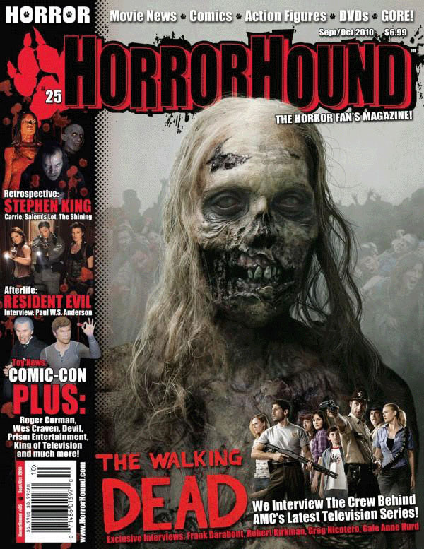
A mid-close up shot is used on the zombie focusing mainly on the facial and body textures. The lighting use appears to be natural or on-set lighting that is placed above the zombie. This main image appears to have been placed above a separate image of a horde of zombies in the background with a lower opacity or lower colour saturation.
The other image advertising the interview of the crew on the bottom right is a wide angle shot in order to fit in the majority of the main characters of the show.
Magazine Conventions
The masthead of the magazine is displayed using a Sans Serif type font. This allows it to have a universal, modern look to it that will suit the majority of the horror films/series that they are going to cover in future issues. The masthead contains what appears to be the magazine’s logo which is of a red paw which suits both parts of the masthead (Horrorhound)
The typography used in the magazine follows a very standard and simple layout. Doing so allows the magazine to appear professional and yet attractive to new and current readers. It uses a generic, red white and black colour scheme; colours appropriate for horror movies.
They used one of the zombie actors from the walking dead as the main image. Not only does the image look scary and realistic, it also gives credit to the costume/make-up artists for the show, as in the series, the zombies are normally overlooked and don’t get as much focus on them. The image is shot by a mid shot allowing the viewers to see that it isn’t just the faces of the zombies that are zombie-fied.
Horrorhound uses a lot of coverlines in their magazines. In this case, it covers Stephen King, Resident Evil and Comic-con. These coverlines include names that are associated with the event/movie/person so the readers know specifically what is being covered. The use of the colour scheme on the coverlines match the images as well as they are contrasting making it easier to read.
The left third of the magazine is where the majority of the coverlines are positioned. The logo is also in the left third allowing the magazine to be easily recognized even without viewing the whole front page. A few letters of The Walking Dead are also in view, and with their logo being iconic to the franchise, it also helps with gaining consumers.
Horror Trailers
Housebound teaser trailer – 2014
Directed by: Gerard Johnstone
Production/Finance company: Semi Professional Pictures
Cast:
Morgan O’Reilly as Kylie Bucknell
Rima Te Wiata as Miriam Bucknell
Glen-Paul Waru as Amos
Cameron Rhodes as Dennis
Ross Harper as Graeme
Ryan Lampp as Eugene
An original film based as a horror-comedy about Kylie Bucknell, a troubled young woman that is arrested after her partner slows her down during their attempt to steal money from a cash machine. She is then put on house arrest and does not get along with her mother and step-father. More frustration is put upon her when her mother calls a radio talk show and tells her that the house is haunted. After an incident in the basement, Kylie believes that there is an intruder in the house.
Mise-En-Scene
The uses of different locations set up the overall plot of the movie, first opening with the shortened scene of Kylie attempting to steal from a cash machine, it then transitions to a court room revealing that she was arrested. The dialogue used during this transition, “you will be placed on house arrest”, accompanies the next scene which reveals where the rest of the movie will appear. The use of location swaps also determine the pace of the trailer. The trailer reveals that the consecutive events escalate rather fast as she goes from a failed robbery attempt into being haunted by a demon in an old home.
A common theme among horror movies (including this one) is isolation. This theme is present throughout the whole trailer. The opening scene is of Kylie and her accomplice, however he manages to knock himself out with the sledgehammer thus emphasising Kylie’s isolation. The next scene, there are only three people present in the courtroom, and in the final location scene, it is of an old house surrounded by a woodland area. This use of surrounding location allows it to have an element of mystery and darkness and also a feeling of being trapped.
The costume of the main protagonist, Kylie, is consists mainly of a leather jacket and jeans. As the film is a horror-comedy hybrid, it will most likely be aimed at teens/young adults; this use of costume will allow them to relate to the character of Kylie as her costume reflects current trends in fashion. Furthermore, the typical teenage action towards their parents of being annoying are portrayed in this trailer allowing for that target audience to be able to relate to something in the movie.
Sound
The judge narrates over the trailer for the first 10 seconds that gives background exposition of the story.
The dialogue of the main characters are accompanied by the use of sound, whenever a comedic line is delivered (“Hold on, they’ve been doing this all week”), there is no music used. However, during discussions of the horror events, it is accompanied by loud booming sounds of the soundtrack to connote the terror felt by the characters and then transferring that fear to the audience. The music during the trailer continues to grow as the tension in the clips rise. The beginning has a slow, eerie droning non-diagetic noise and as more of the movie gets exposed and the action sequences are delivered, the soundtrack increases in pace and loudness; loud "inception" sounds (the loud bwaaaas in trailers, made famous by the movie "Inception".) accompany the scares in the films to intensify the events.
Camera Angles & Editing
The use of “cuts” vary depending on the event that is happening. In the beginning where it is slower, transitions and normal cuts are used to match the events occurring, then, later on quick cuts are used when the action increases; not only does this makes the scenes more effective, it also conceals the identity of the main antagonist so not everything is given away in the trailers. There are a lot of high angles and close ups used on the victims to emphasize their vulnerability.
Insidious Chapter 3
June 5, 2015
Directed by Leigh Whannel
Production companies: Automatik Entertainment, Blumhouse Productions, Entertainment One
Distributed by: Focus Features, Gramercy Pictures and Stage 6 Films
Cast:
Lin Shaye as Elise Rainier
Dermot Mulroney as Sean Brenner
Stefanie Scott as Quinn Brenner
Leigh Whannel as Specs
Hayley Kiyoko as Maggie
Tate Berney as Alex Brenner
Insidious Chapter 3 is the third instalment of the Insidious trilogy, however, rather than being the resolution to the series, it is a prequel to the first two films.
The film is set before the events of the first two films. Elise Rainier, a medium has reluctantly agreed to use her abilities to help contact the deceased mother of Quinn Brenner, Lilith. Quinn believes that her mother had been trying to contact her but Elise advises her not to call back, because “if you call out to one of the dead, all of them can hear you.” She records the events in the house but stops when a demonic presence responds with a threat to kill her.
Mise en Scene
Throughout the trailer, there is very little lighting; at the start there are only dots of light, from either candles or Christmas decorations. The rest of the trailer is of dimly lit rooms or rooms that are lit up by blue light. This is common among movie trailers to either connote mysticism, fear and secrecy. The blue light reveals their change in location as the movie focuses on travelling between the spirit and human realm.
NVC’s of the different characters vary depending on the role they play in the story. The family members tend to be shocked or scared that their daughter is being possessed, while the medium, Elise tends to be serious and has a straight face. She as a lot of slow, monotone movements, which could either be because of her age or her desensitization to the events; whereas the family portrayed more expressive movements.
The setting of the trailer revolves between the apartment that her and her father live in, to the spirit version of the same location, mainly in her bedroom.
The main props seen in the trailer are mainly sources of light, like a match, a torch or a computer screen. This gives the element of fear ad secrecy throughout the trailer as nothing is fully lit up and clear for the audience to see.
Sound
Dialogue opens up the trailer of the girl reminiscing about how she misses her mother and how school as affecting her life. As it is a moment of nostalgia and remembrance, light-hearted music is playing in the background while she narrates over b roll footage. When the trailer reveals the face of her mother vanishing from her door, the music stops and shifts over to a darker and eerie tone. This switch is followed by the advise from Elise and a crescendo ring to increase tension and anticipation and the deep groaning/breathing of a man.
Non-diegetic noises are used over the footage to intensify the jump scares.
In some cases, the trailer just uses a droning noise to create the same effect and when credits/text appear on the screen. There is also a female rendition of ‘Tiptoe through the tulips” by Tiny Tim that plays during the darker part of the trailer which nowadays is a common convention.
Diegetic noises like door slams, footsteps, crashes and sudden screeches are prominent throughout the trailer to add another fear factor. The distorted laughter also gives us a sense of what the antagonist is and from the depth of his voice, we get the image that it is a male antagonist.
Narration from the trailer changes from the girl who gets attacked to Elise. This also determines the pace of the trailer as when the girl is talking, it is faster and much more reluctant. However, when Elise takes over, events get faster and her narration is slower and less frequent, this reflects the seriousness and gravity of the situation.
Camera Angles & Shots
The trailer uses mainly close ups, match on action and establishing shots throughout the trailer to give the scale of the impact that the demonic presence has.
Shots that would normally use long takes have been edited so they are more jumpy and have a stronger impact on the viewers.
Audience and Overview
The characters are mainly conventional, there is a family, one of which gets possessed by a demon/multiple demons and they require the help of a medium/demon hunter to get rid of said issue.
The target audience as with most horror movies nowadays is aimed for teenagers/young adults as it doesn't show too much graphic content, only minor jump scares and possessions, no blood/mutilations are seen like in the SAW saga.
The Visit trailer - 2015
Directed by M. Night Shyamalan
Production companies: Blinding Edge Pictures, Blumhouse Productions
Distributed by: Universal Pictures
Cast of Jamison family: Olivia DeJonge (Rebecca), Ed Oxenbould (Tyler), Kathryn Hahn (Paula), Deanna Dunagan (Doris), Peter McRobbie (John)
The Visit is a comedy horror movie with a handheld/found footage camera style. It focuses on two children, Rebecca and Tyler, who are preparing for a week-long stay at their grandparent's house, John and Doris while their mother, Paula, is away. They planned on documenting their visit as they have never met their grandparents before. The grandparents advise the kids to be in bed by 9:30 pm and not to leave their room past curfew. As the kids venture downstairs, they discover something dark about their grandparents.
Mise En Scene
There doesn't seem to be any special lighting used in the trailer as it is filmed with a handheld camera, so the lighting would be natural.
Tyler and Rebecca's NVC changes throughout the trailer. At first, they are excited to spend the weekend with their grandparents introducing them to their documentary. The first skype call to their mother states that they are "having a great time" and they are all smiling, even the grandparents. When their grandparents tell them that they shouldn't leave their room after 9:30 pm however, their attitude changes and they become more curious and discover their grandparents acting strangely. This sets up the second skype call to their mother and tell her that "grandma's acting weird". The mother then tells them that "they're weirdo's"; this gets the kids worried and start to be more careful, yet worryingly curious, to find out more about their grandparents.
The setting for the story appears to be in their grandparent's farm in the winter. This sets up well for a horror movie as the atmosphere is literally cold and chilling. Not only that, it sets up a scenery perfect for mysticism as fog envelops over their grandparent's land. The house itself too, remains very claustrophobic as it consists of a lot of narrow corridors. A scene is also shown when Rebecca is in a ventilation duct and what appears to be her grandmother is stalking her. The use of scenery and location in the trailer sets it up for a vulnerable and isolated story as they traverse upon new grounds unfamiliar to them.
Sound
The diegetic sounds used in the trailer were mainly used to give off exposition for the audience, like the conversation with their mother on skype and them introducing their grandparents.
The non-diegetic sounds, like in most horror trailers, are either used to give further background exposition, or to intensify the atmosphere or to emphasize the scale/impact of the events occurring. In this case, when the grandmother scratches the walls on their first visit downstairs after 9:30pm, it sounded unrealistic. This may be done to connote that she had been possessed and that she isn't herself. Furthermore, the music used helps set the mood of their current events. In the first half, there is upbeat music playing in the background of a guitar playing in tune which reflects their excitement and positivity of meeting their grandparents. However, when the information is dropped ("be in bed by 9:30pm and don't leave"), it changes the music to something more dramatic and tense. This is a common convention among horror trailers and is seen in the trailer for Insidious Chapter 3. The use of the non-diegetic sounds also control the pacing of the trailer; in this case it is split in half, the happy part, and the grim beginnings.
Shots and Editing
As the film is shot with handheld, a lot of the shots used are either mid-close ups or establishing shots when the camera is positioned somewhere on the set.
The only text appearing that is made from post production is the credits to the director and production companies which state the films they partook in to generate some sort of 'hype' for the audience as the movies listed were generally a success. The other type of text is used earlier in the trailer when the children film a cut pieces of paper that say "there's no place like grandma's". This generates the irony of the children's excitement due to the events about to be shown.
The target audience the film seems to be appealing to is teenagers/young adults. It is easy to notice this due to the young actors used (being children) so there would not be too much graphic content in the film to be an 18+ only.
Horror Posters
One Missed Call 2008
Directed by Eric Valette
Shannyn Sossamon as Beth Raymond
Edward Burns as Detective Jack Andrews
Ana Claudia Talancon as taylor Anthony
Ray Wise as Ted Summers
Azura Skye as Leann Cole
Johnny Lewis as Brian Sousa
Jason Beghe as Ray Purvis
Production company: Alcon Entertainment, Kadokawa pictures, Equity Pictures and Intermedia Films
Distributed by Warner Bros. Pictures in the US and Kadokawa Pictures in Japan
One Missed Call is a 2008 American supernatural horror film. It is a remake of Takashi Miike’s 2003 Japanese film with the same name. It was based on the novel of Yasushi Akimoto titled Chakushin Ari.
The general plot of the story is psychology student Beth Raymond is shocked with the deaths of four people she knew, Shelley, Leann, Brian and Taylor. They apparently received a phone call from their future selves, which revealed the exact time of their deaths. She reports the events to the police but they think she is delirious. However, one cop believes her, Detective Jack Andrews, and decides to help her, as she is the next one to receive the call.
Mise-en-scene
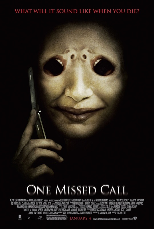
There is very little lighting in the poster, only light that reveals an incomplete face of what appears to be a woman, whom, presumably is the antagonist of the film whose, instead of eyes, are the mouths of her victims, creating a grim and eerie image due to the composition of the face, making her appear almost alien, thus supporting its supernatural theme.
The only prop used in the poster is the phone, which is a key element to the film as its main plot revolves around victims receiving a phone call about their deaths.
The camera angle used is a mid-shot eye angle. This could connote how the protagonists will have to directly face their antagonist during the story to stop future deaths.
The use of these different techniques creates a grim and mysterious mood for the movie, especially with the composition of the antagonist’s head appearing to be emerging from the shadows.
Poster Conventions
The poster uses a generic font. There is very little reveal in the poster, only the tagline and the title of the movie. There are no names of the actors who are playing the characters in the movie. The tagline is of a different colour to everything else which gives it its sinister look. Because of the lack of content in the poster, I would assume that it is a teaser poster to generate excitement for the movie. There are also no quotes from review sites/companies that praise the film as there were no review screenings.
The tagline reflects the unique selling point of the movie as it relates to a call leading to someone's death.
The poster follows a typical convention seen among the horror genre where the faces of either the victim or antagonist are merged together to create a horrifying image or that containing gore.
There is credits to all funding and sponsoring companies at the bottom of the poster, giving notes to actors, directors, important personnel and the release date.
Directed by Eric Valette
Shannyn Sossamon as Beth Raymond
Edward Burns as Detective Jack Andrews
Ana Claudia Talancon as taylor Anthony
Ray Wise as Ted Summers
Azura Skye as Leann Cole
Johnny Lewis as Brian Sousa
Jason Beghe as Ray Purvis
Production company: Alcon Entertainment, Kadokawa pictures, Equity Pictures and Intermedia Films
Distributed by Warner Bros. Pictures in the US and Kadokawa Pictures in Japan
One Missed Call is a 2008 American supernatural horror film. It is a remake of Takashi Miike’s 2003 Japanese film with the same name. It was based on the novel of Yasushi Akimoto titled Chakushin Ari.
The general plot of the story is psychology student Beth Raymond is shocked with the deaths of four people she knew, Shelley, Leann, Brian and Taylor. They apparently received a phone call from their future selves, which revealed the exact time of their deaths. She reports the events to the police but they think she is delirious. However, one cop believes her, Detective Jack Andrews, and decides to help her, as she is the next one to receive the call.
Mise-en-scene
There is very little lighting in the poster, only light that reveals an incomplete face of what appears to be a woman, whom, presumably is the antagonist of the film whose, instead of eyes, are the mouths of her victims, creating a grim and eerie image due to the composition of the face, making her appear almost alien, thus supporting its supernatural theme.
The only prop used in the poster is the phone, which is a key element to the film as its main plot revolves around victims receiving a phone call about their deaths.
The camera angle used is a mid-shot eye angle. This could connote how the protagonists will have to directly face their antagonist during the story to stop future deaths.
The use of these different techniques creates a grim and mysterious mood for the movie, especially with the composition of the antagonist’s head appearing to be emerging from the shadows.
Poster Conventions
The poster uses a generic font. There is very little reveal in the poster, only the tagline and the title of the movie. There are no names of the actors who are playing the characters in the movie. The tagline is of a different colour to everything else which gives it its sinister look. Because of the lack of content in the poster, I would assume that it is a teaser poster to generate excitement for the movie. There are also no quotes from review sites/companies that praise the film as there were no review screenings.
The tagline reflects the unique selling point of the movie as it relates to a call leading to someone's death.
The poster follows a typical convention seen among the horror genre where the faces of either the victim or antagonist are merged together to create a horrifying image or that containing gore.
There is credits to all funding and sponsoring companies at the bottom of the poster, giving notes to actors, directors, important personnel and the release date.
The Amityville Horror 2005
Directed by Andrew Douglas
Production Company: Platinum Dunes and Radar Pictures
Distributed by Metro-Goldwyn-Mayer and Dimension Films
Ryan Reynolds as George Lutz
Melissa George as Kathy Lutz
Jesse James as Billy Lutz
Chloe Grace Moretz as Chelsea Lutz
Rachel Nichols as Lisa
Philip Baker Hall as Father Callaway
Isabel Conner as Jodie DeFeo
Brendan Donaldson as Ronald “Ronnie” DeFeo, Jr.
The Amityville Horror is a remake of a 1979 film of the same name which was based on the novel with the same name by Jay Anson, in which documents the experiences of the Lutz family after they moved into a new home in Long Island. A mass murder was then commited by Ronal DeFeo, Jr in which he murders six members of his family in 1974.
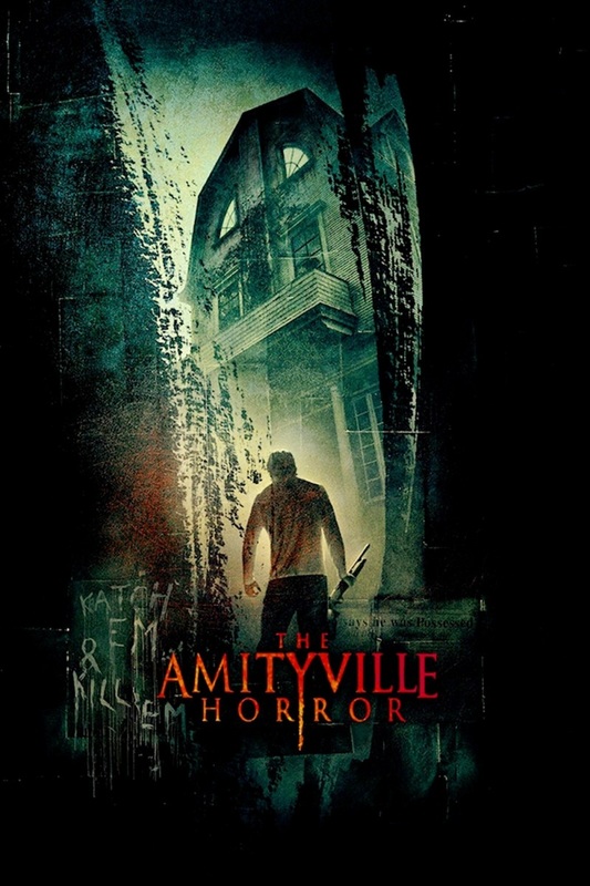
Mise-en-scene
The lighting use of the lighting in the poster, in which there is very little of it, focuses on what appears to be the protagonist looking up at the house. This unusual composition makes it seem that the antagonist is the house itself, as the house itself is towering over the person and looks very intimidating.
The NVC of the character looks as if he just came out of a struggle and appears to have committed a crime as it appears that he is looking down at something with a shotgun in hand.
The setting appears to be in a swamp-like area due to the dirt/moss around the character.
The foreground of the image also has writing on the left hand side, which vaguely translate into something like “Catch em” and “kill em”. Using these phrases along with the cut look, the poster could be interpreted in a way that someone, for example, is in a shed and is peaking at our supposed “protagonist”.
The composition of the title is symmetrical, contrasting the image itself, which retains an asymmetrical composition. This use of composition, especially with the phrases that are present in the foreground of the image, invokes a dark sense of fear. The phrases somewhat connote an external antagonist that is controlling the rest of the characters in the story as it is giving them orders such as “kill em”
The dark colours of green and black give the essence of decay and disease to be present in the poster, especially with the sides of the foreground looking like they have been ripped apart, almost like a sharp object tore through it.
Poster Conventions
The only tag line they have used is “based on a true story” which alone itself is enough to intensify and create excitement for the movie as it applies legibility in the story it is telling. Like most horror posters, there isn’t any use of quotes from reviews. This is done so that there is no distraction from the main topic of the images. Furthermore, it doesn’t ruin the atmosphere the image creates.
The poster follows common conventions of posters by keeping the character’s faces a secret and presenting a horrific sight either through the text itself or the image.
The Last Exorcism 2010
Director: Daniel Stamm
Cast:
Ashley Bell as Nell Sweetzer
Patrick Fabian as Cotton Marcus
Louis Herthum as Louis Sweetzer
Iris Bahr as Iris
Caleb Landry Jones as Caleb Sweetzer
Shanna Forrestall as Shanna Marcus
Production company: Strike Entertainment, Studio Caal and Arcade Pictures
Distributed by Lionsgate with a budget of $1.8 million
The Last Exorcism is a found footage film that follows an evangelical minister who decides to document his last exorcism while exposing the fraud of his ministry. He then receives a letter from a farmer who is asking for help in driving out the devil, in which the movie’s story begins after he meets the farmer’s possessed daughter.
Three years later, it spawned a sequel titled The Last Exorcism Part 2
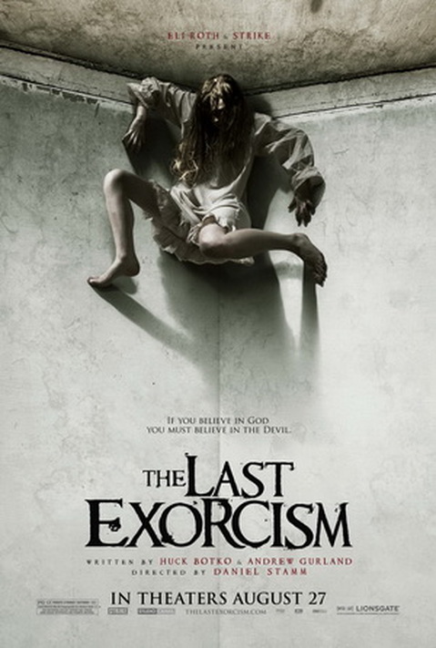
Mise-en-Scene
As it is a film with a religious focus, the lighting used conveys the fight between good and evil, the bright white light is above the character and the shadow (the darkness) is below. It almost gives away the ending of the film because of the amount of light in the poster, connoting that the good will win while the ‘darkness’ fights to exist.
The NVC of the girl has common conventions when it comes to the horror genre as she is in a very disturbing position and her setting (the fact that she’s on the top corner of the walls and the ceiling) gives off a negative atmosphere to the viewers. The concealment of her face also gives her a sense of anonymity, not only making her character more intimidating, but also makes the audience curious of who it could be. This, accompanied with the use of a low angle shot further increases her power over the audience, but the use of a long shot distances the audience from her giving them a false sense of safety.
No props are used in the poster, it can be said that the girl herself is a prop for the true villain that has possessed her; this lack of use shows that the antagonist in the story is stronger and much more extraordinary than conventional antagonists.
The colours in the image are highly saturated which connotes decay and disease, especially with the colours on the borders of wall to ceiling, as if mould were forming there.
There is a soft focus on the character giving her a sense of anonymity and fear.
Poster Coventions
The tagline in the poster also sets the general tone of the film, basing the ultimate protagonist and antagonist, but leaving the character names hidden. The names of the actors are not present, so it shows that this must be a teaser trailer as quotes from critics, newspapers and magazines are not to be seen. This could also be problematic for the success of the film, as they do not have backing praise from companies who are well known in the industry.
The fonts used in the poster match the overall theme of the film; the religious aspect is reflected in the old fashioned Serif font used that seems basic and common in religious texts, whereas the smudges in the title portray the horror aspect of the movie as it gives the illusion of corruption, which is a main theme in the film. Furthermore, the low frequency of the colour red connoting danger is present in the poster but not too much of it.
