"How effective is the combination of your main product and ancillary text"
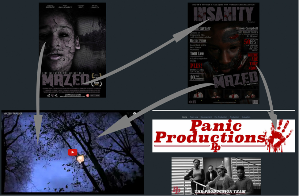
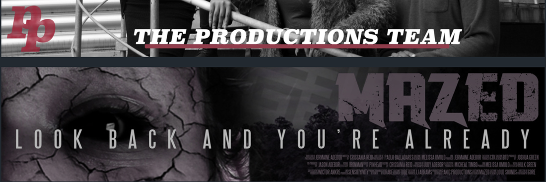
Welcome to our Evaluation question 2 page. Here you get the chance to see panic productions film Mazed presented across many different media platforms, such as games, tv, radio, apps and many more. We will be focusing in synergy throughout all our 3 main final product and the different forms of cross media convergence.
The impact of having a strong branding is very important this is seen in Horror films particularly if it aims to becoming more than just a movie and grows into a franchise, this is something we will be discussing on this page. We will show how the brand identity
AN EXAMPLE
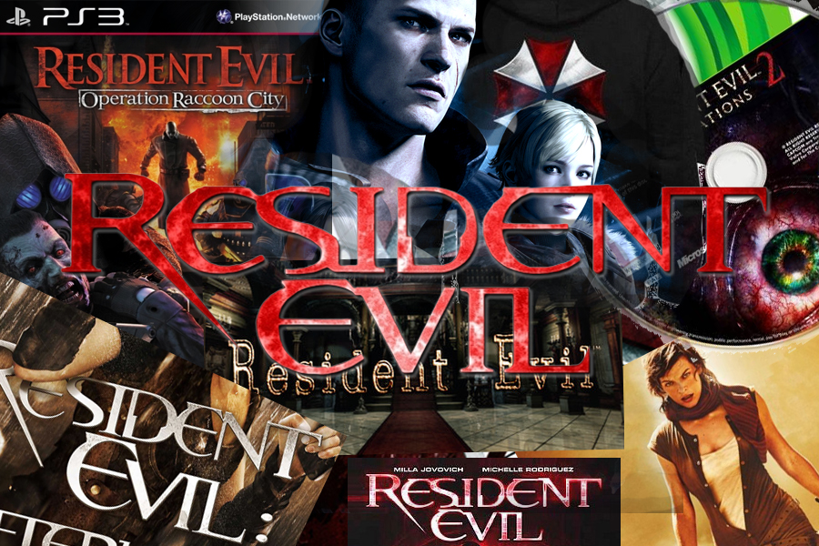
Resident Evil Brand
|
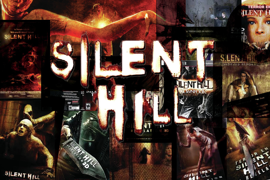
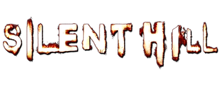
Silent Hill Brand
|
You are able to tell that the films belong together because the branding is so strong that you are able tell the product belongs to the film as its identifiable to the film.
Real Media Text
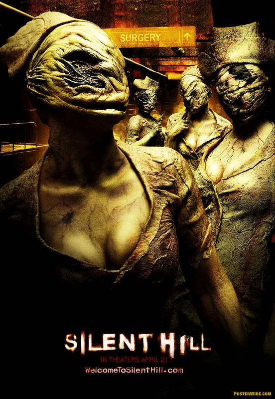
Silent Hill Branding
An excellent example of a horror franchise that uses CMC and Synergy incredibly well is Silent Hill. Silent Hill is a Japanese horror franchise created by Keiichiro Toyama and published by Konami and its subsidiary Konami Digital Entertainment.
Adaptations; Silent Hill (2006)
Genre; Survival horror
Creator; Keiichiro Toyama
Composers; Akira yamaoka, Daniel licht
Designers; Sam Barlow, Keiichiro Toyama
Publishers; Konagi, Sony Computer Entertainment
Adaptations; Silent Hill (2006)
Genre; Survival horror
Creator; Keiichiro Toyama
Composers; Akira yamaoka, Daniel licht
Designers; Sam Barlow, Keiichiro Toyama
Publishers; Konagi, Sony Computer Entertainment
Silent Hill
|
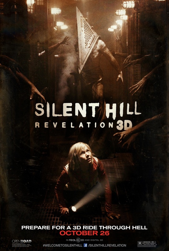
Silent Hill Revelation 3D
|
Silent Hill Revelation 3D
|
Silent Hill
|
Film Poster
|
Silent Hill movie trailer
|
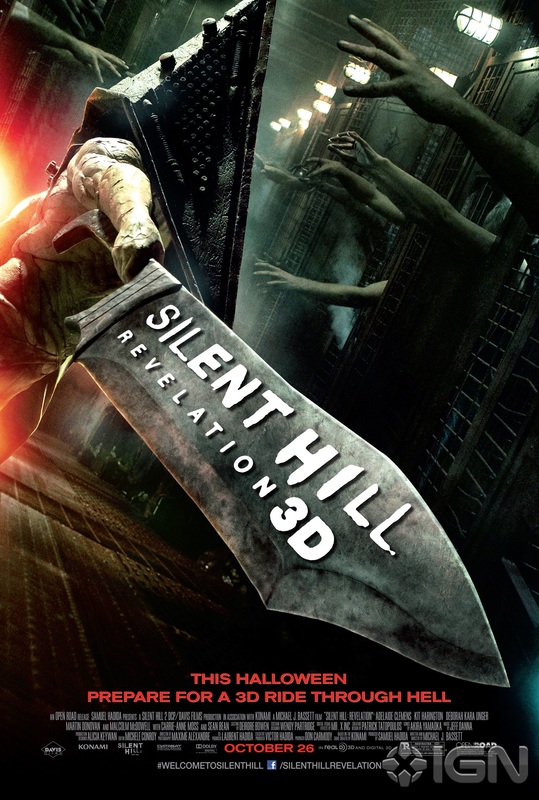
Silent Hill Revelation 3D
|
Film Trailer
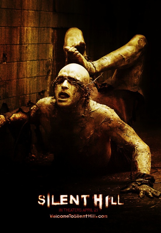
After the success of the Silent Hill movie, Silent Hill now has its own video game. the continuity and the branding throughout all the their products is what makes Silent Hill so marketable and east to sell. It doesn't matter what product it is you are able to recognised that it alongside Silent Hill, this is because of he same colour scheme and typography. The use of dark backgrounds and orangey mist has become their own style in a way. The reason people would say that is because its used in almost all their products.
|
Sony Computer had a budget of 50 million US dollars. Meaning for promotion and advertisement they would have enough to spent to get the advertised. On the picture in the left you can see the billboard image with the Silent Hill poster on it, once again the use of branding makes it easier for people to know what the films is because some people may have some seconds to see the poster as they are driving and because of the branding even if they look for a couple seconds they will still be able to figure out the film by the amazing branding they have made.
|
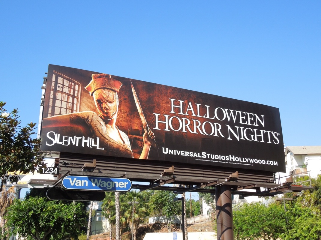
Silent Hill Billboard
|
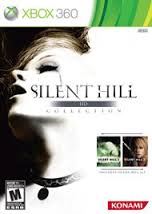
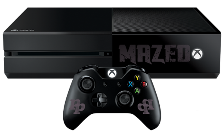
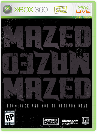
Silent Hill Game Cover
(Xbox 360) |
Not a lot of horror films are able to turn their product into a game, Silent Hill was able to produce three video games. The game on the right use the orangey black text seen in other posters and trailers. Were as the game on the left has an image of the final girl.
|
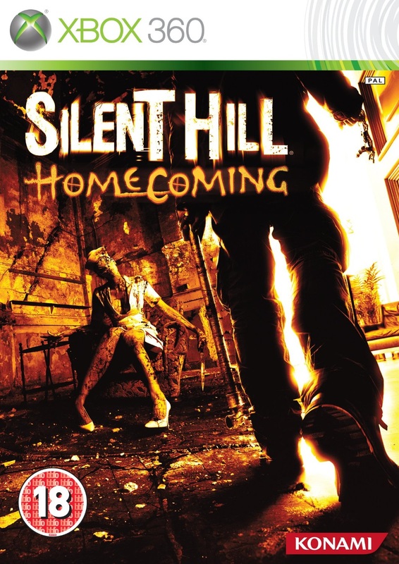
Silent Hill Game Cover
(Xbox 360) |
The film video game on the left doesn't follow the same colour scheme as the other products, but the typography is the same because they have such a unique typography that could stand out as a brand on its own. What we like about the games cases is that even though its a video game case you can still be able to recognise that both games belong to the film
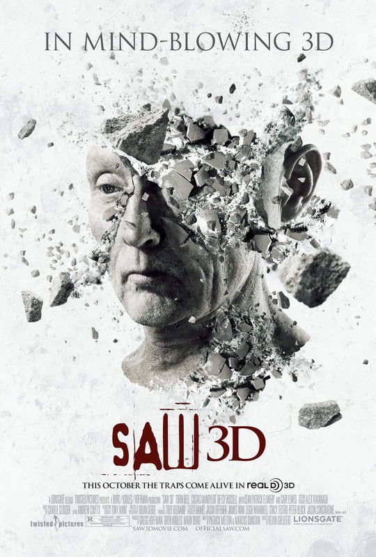
Here is another perfect example of the continuity present throughout different media platforms. On the Blu Ray cover of Saw 3D we see a very similar concept to the one on the billboard. A very similar mouse trap style weapon appears on the cover with the very recognisable "Saw" title although this time in which and with the "3D" element missing. According to the Nielsen VideoScan chart, the DVD and Blu-ray formats placed number three in its first week.
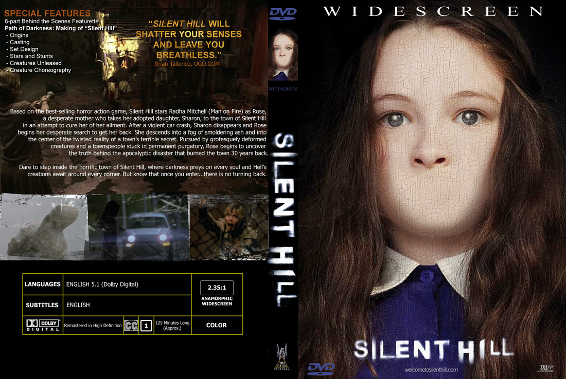
Silent Hill DVD Cover
|
Here is another example of continuity. This is shown though the typography and the colour scheme being similar or the same to the once used on posters and magazines and video gams covers. once again the use go orangey black colours have a huge part. In the image of the girl, they took her mouth away. we've seen this in most images for Silent Hill. This could be motif within the images and another way to brand the products with out using colour schemes or typography.
|
|
This jumper is simple and has a huge impact, because the typography on the jumper is the same in over Silent Hill products. This would be helpful when they are selling it as the product already screams out Silent Hill. Even thought they didn't use the the colour scheme they normal use which is orangey black. The typography is the same and that makes up for the lack of the colour scheme.
|
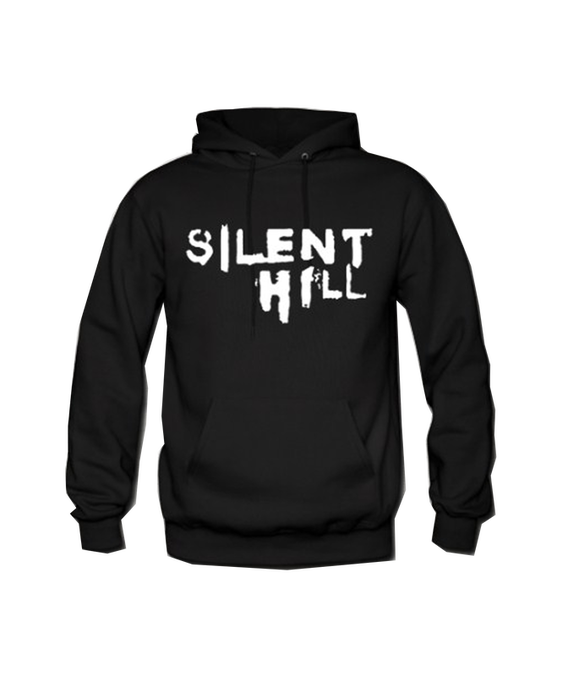
Silent Hill Clothing, Jumper
|
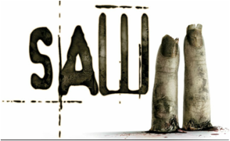
Saw Branding
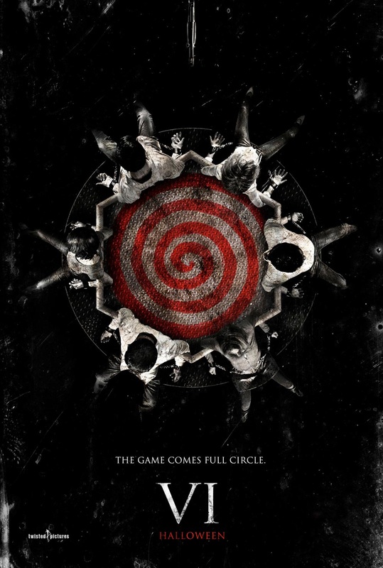
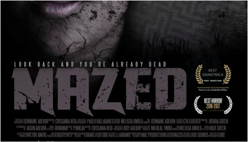
AAnother great example of a horror film that had a great brand and use of synergy and cross media convergence and lots of series is Saw. Saw is a horror franchise distributed by Lions Gate Entertainment and produced by Twisted Pictures that consists of seven feature films and additional media.
Adaptations; Saw (2004), Saw II (2005), Saw III (2006), Saw IV (2007), and Saw V (2008). The sequel to Saw VI is Saw 3D (2010).
Genre; Survival horror, Thriller
Creator; James Wan
Composers; Charlie Clouser
Designers; Julie Berghof
Publishers; Lions Gate Entertainment
Adaptations; Saw (2004), Saw II (2005), Saw III (2006), Saw IV (2007), and Saw V (2008). The sequel to Saw VI is Saw 3D (2010).
Genre; Survival horror, Thriller
Creator; James Wan
Composers; Charlie Clouser
Designers; Julie Berghof
Publishers; Lions Gate Entertainment
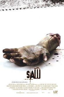
Saw 1
|
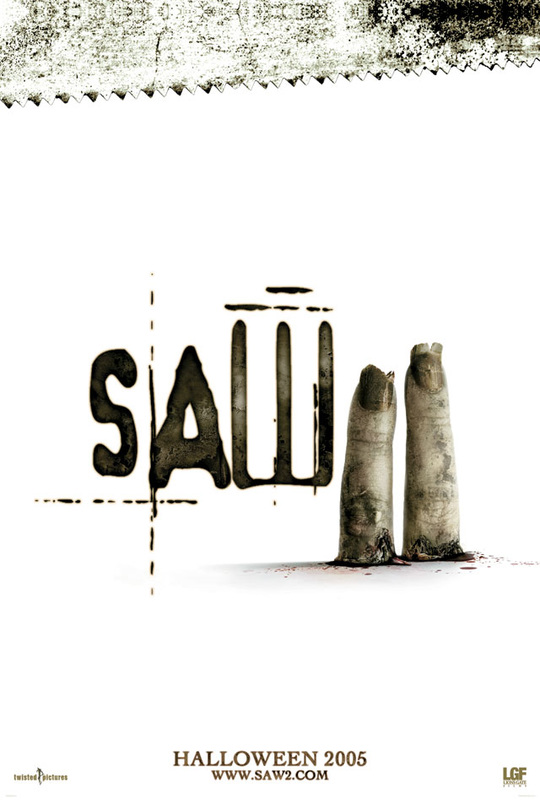
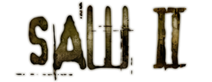
Saw 2
|
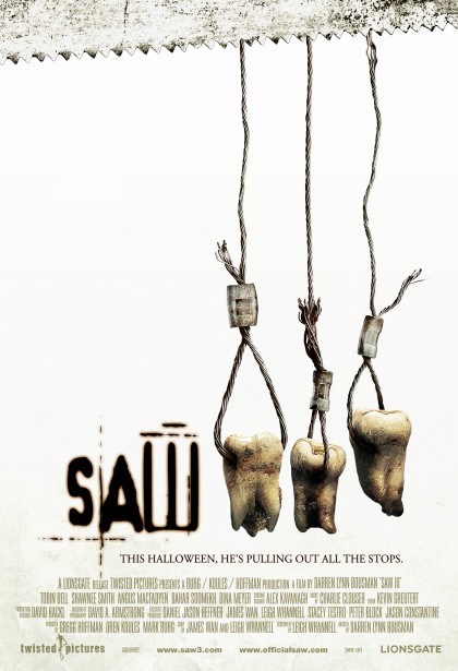
Saw 3
|
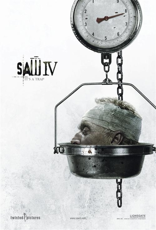
Saw 4
|
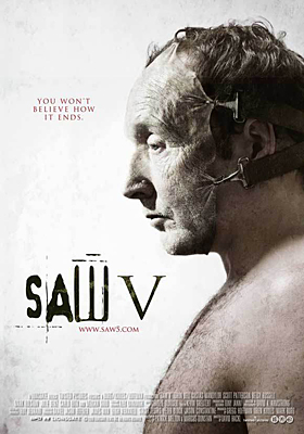
Saw 5
|
Saw 6
|
Saw 7 (3D)
|
|
Saw 1 trailer
|
Saw 2 trailer
|
Saw 3 trailer
|
|
Saw 4 trailer
|
Saw 5 trailer
|
Saw 6 trailer
|
Saw 7 (3D) Trailers
The main reason we choose Saw as an example is because unlike Saw was able to make 7 films and have all of the films a huge success and grossed $873,319,880 Worldwide, from an estimated budget of $64 million. Saw was able to have some films in 3D meaning they was able to market and get more people to watch it. Saws films brand identity allowed them to create games and still be able to market it like the films because people are able to see and identify that they belong together.
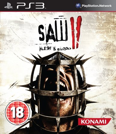
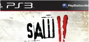
Saw Game Cover
(Ps3) |
The Saw games became a huge success as the films became successful. The game share the same logo as the posters for the films, even the use of the dying white colour scheme and the doll red bloody colour is used though outSaws products. On the case you se an image of a man in what is could a human mouse trap. These weapons are like a motif as Saw is based around using humans traps, These types of images has become one of Saw unique branding.
|
Saw Game Logo
|
The image on the left is the typography for Saw The Game. The image on the right is typography for the film poster. Now due to the branding within the company, you are able to tell that the content for both different media platforms belong together. Also because they use the same colour scheme, which is a dying pale white colour.
|
Saw Film Logo
|
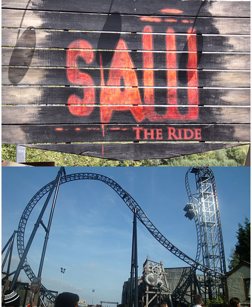
Saw The Ride (Thorpe Park)
|
The Saw franchise also have Ride.They also Saw: Alive which is a live action horror maze. Where you have a hands on experience, think of it like a day in Saw. What we like about this is the continuity is still there. You can see the same typography and colour scheme used are the same as the once on the film poster and games covers.
|
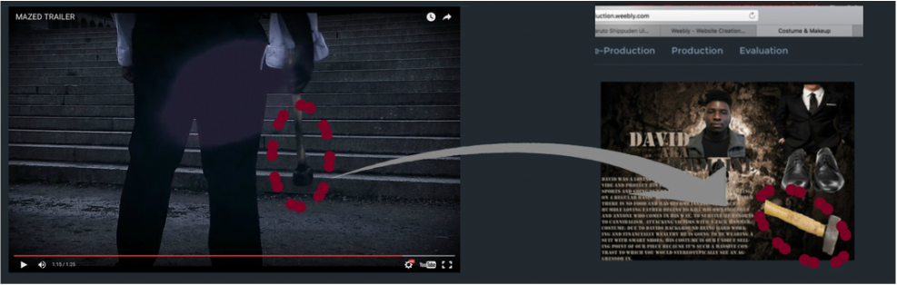
Panic Productions Continuity branding skills
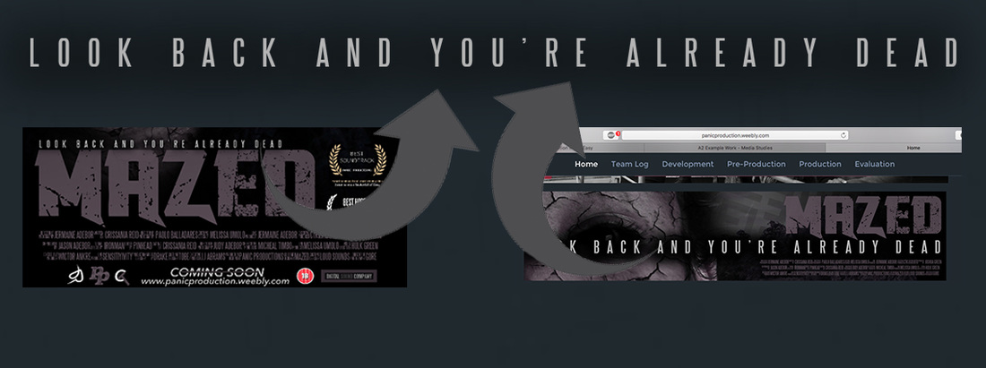
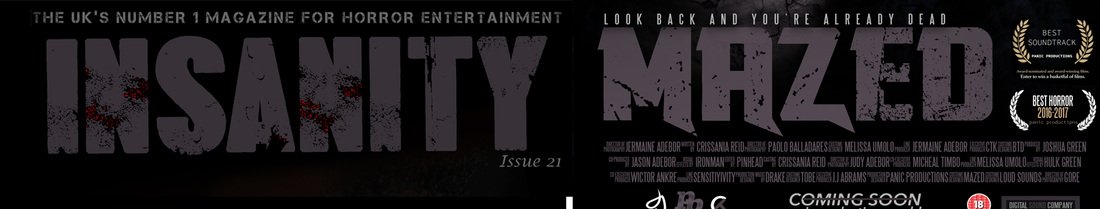
Here we'll show you how we branded our products and how we used things like typography, tag lines, colour scheme, shots and frames and team logs and more to help further push our brand within all our products.
Title & Typography
One way continuity was shown alone our products was by the Typography. by using the same type of Typography people are able to know and tell that its all under one company
|
Poster
|
Magazine
|
Trailer
|
Website
|
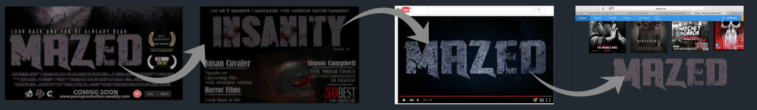
As you can see with in all our products we kept the same Typography in our poster, magazine trailer and website. This no has become one of the ways people can identify us. In a way its because our style.
Even if the colour our different you are still able to tell its the same kind of Typography, this allows us to be more unique as we could use lots of colour and not be worried that it will change the style thats in other product.
Even if the colour our different you are still able to tell its the same kind of Typography, this allows us to be more unique as we could use lots of colour and not be worried that it will change the style thats in other product.
Team Logo
One other way to show continuity within our products is by show our logo. This could be by putting it in the corner because we made the logo small we are able to drop it in an corner and it will still stand out well.
|
Poster
|
Website
|
Magazine
|
Trailer
|
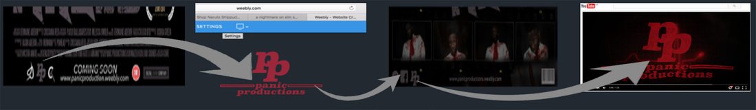
By adding our logos on all our products it gives us a professional look it also brings everything together, by giving it one more link between all products. Just like the Typography it doesn't matter what colour it is. For example the poster is purple and the website and trailer is red but you can still see the link between the products.
Another great thing is the small logo which is seen on the magazine and poster and the big ones are on the website and trailer.
Another great thing is the small logo which is seen on the magazine and poster and the big ones are on the website and trailer.
Tag Line
The thing line is what we thing sells the films so we made sure that we made the tag line present with in all products
|
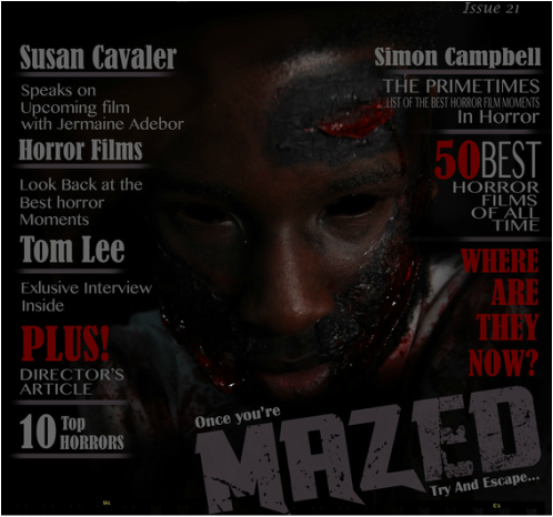
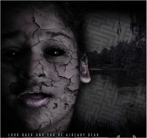
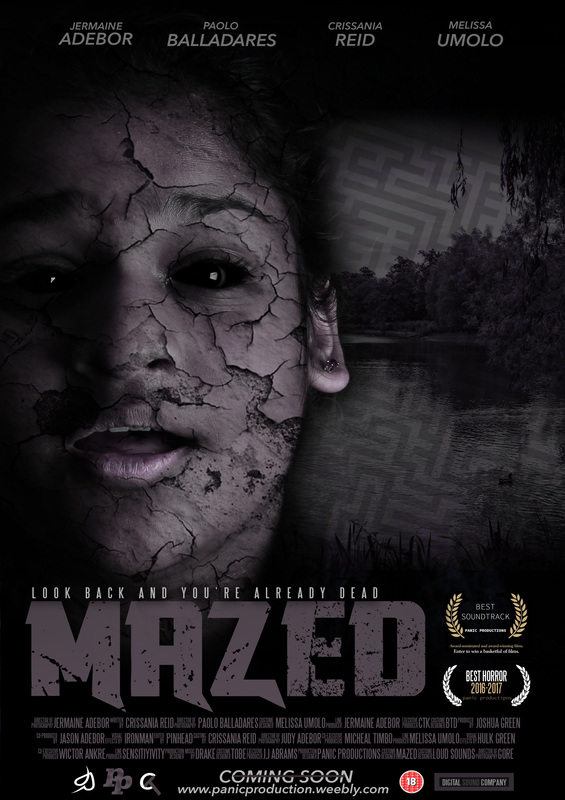
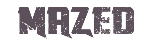
Mazed poster
|
website
|
The tag line is present on our poster (image on the left) and website (image in the right). The font for the tag line is the same on both poster and website, this was so belle we see the two and recognise that its part of the Mazed brand. However we found it hard to add the tag line to our magazine and trailer because we didn't want to over use it to the point it becomes less powerful.
Lighting
The light was important as we felt like because its a horror we should kind of make it dark and gloomy, we felt like we was able to do this by the following.
As you can see we made the website and poster and magazine and trailer all dark, even though this is a small touch it does give the whole production a horror look and this helps all the different products become one.
Settings
The setting we used is like a maze this is seen in our poster and trailer. We felt it hard to make the setting known in the magazine and website
The whole horror ideas was a maze so we felt to show the maze within our trailer and poster, this was because of our films name Mazed
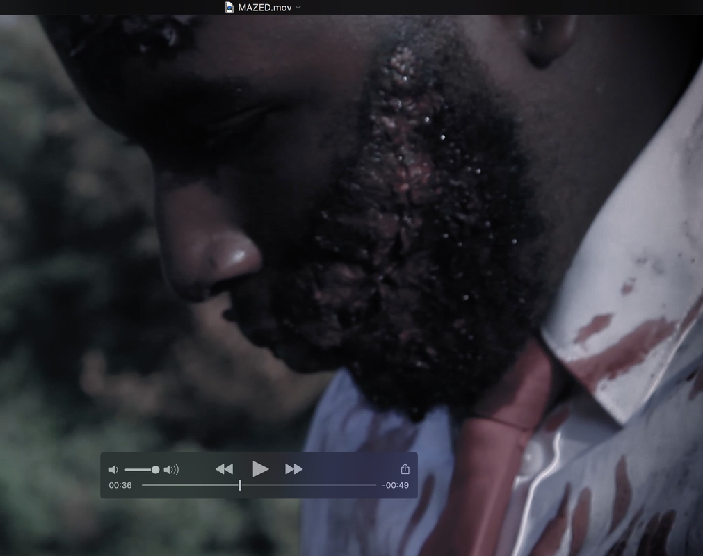
Protagonist & Antagonist
As our film is horror related we felt like we show give Mazed a face so we used the Protagonist and the Antagonist to be the faces of our product
Mazed poster Mazed magazine
website (middle row)
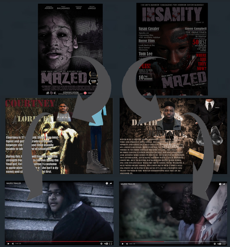
Trailer
Our protagonist and antagonist is present in both our magazine and poster and the website. This allows us to us the protagonist and antagonist as a way to further brand our sims and keep the flow betweens brands
Props
When thinking of our Mazed and panic brand we felt like we could use unique props to stand out, we used the prop in the following format to grab the attention of the costumer.
|
Mazed trailer
|
Website
|
Colour Scheme
when keeping the Continuity to keep our branding strong we also kept the same kind of colour scheme going on. Our colour scheme for our products was RED BLACK AND PURPLE.
|
Mazed poster
|
Mazed magazine
|
|
Mazed trailer
|
Panic website
|
Even between our four products you can still see the same colour scheme being used in our Poster Magazine Trailer and Website. By doing this we felt like we created a home base for all our products as they have the same elements to it. We also things it sends a message to everyone that our products are all created and fixed around each other
Real Media Text Comparison
Here we look at how our branding and continuity skills compare with real media text. This is our forum of research to see to see how well we link our main products together with the website.
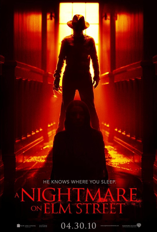
A Nightmare On Elm Street (Poster)
|
A Nightmare On Elm Street (Magazine)
|
Imagery
The similarities between the poster and magazine are the images have the same layout. For example both the images show the antagonist looking down at what we thing is the final girl, also the shots are both taken at a low angle making the antagonist look more bigger and scary towards the protagonist. The poster and magazine both show the protagonist to be smaller and weaker and at the pray of the antagonist.
The similarities between the poster and magazine are the images have the same layout. For example both the images show the antagonist looking down at what we thing is the final girl, also the shots are both taken at a low angle making the antagonist look more bigger and scary towards the protagonist. The poster and magazine both show the protagonist to be smaller and weaker and at the pray of the antagonist.
Font
Font used in the magazine is not the same on the poster. However it doesn't make you question if it still belongs to the nightmare on elm street company.
Font used in the magazine is not the same on the poster. However it doesn't make you question if it still belongs to the nightmare on elm street company.
Colour Scheme
We choose this poster and magazine was because the colour scheme was represented well in both the poster and magazine well. The red and black colour was used in the background of the poster and in the magazine this creates home base theme.
We choose this poster and magazine was because the colour scheme was represented well in both the poster and magazine well. The red and black colour was used in the background of the poster and in the magazine this creates home base theme.
Characters
The antagonist and protagonist are both present in the poster and magazine
The antagonist and protagonist are both present in the poster and magazine
TEAM PANIC
|
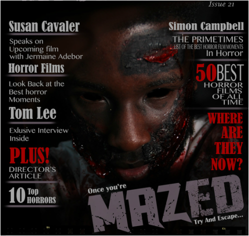
Mazed Magazine
|
Mazed Poster
|
Imagery
Between the Poster and Magazine the imagery are not really the same and don't show the same elements. However they both portray horror and that was main objective that we was trying to achieve. One similarity is the eyes, we keep the blacked out eyes as our motif and we made it one of our key points when editing the images for Mazed.
Between the Poster and Magazine the imagery are not really the same and don't show the same elements. However they both portray horror and that was main objective that we was trying to achieve. One similarity is the eyes, we keep the blacked out eyes as our motif and we made it one of our key points when editing the images for Mazed.
Font
The font is the same on both products. We liked the way the text looked so we used the same font for the magazine. This then lead to us using the same colour as the poster, this was so our branding grows stronger so people will be able to recognise the Mazed brand anywhere.
The font is the same on both products. We liked the way the text looked so we used the same font for the magazine. This then lead to us using the same colour as the poster, this was so our branding grows stronger so people will be able to recognise the Mazed brand anywhere.
|
Mazed Magazine
|
Mazed Poster
|
Colour Scheme
The colour scheme for the magazine is black and red. The red was used to show how bloody to content is. Were as the posters colour scheme is black and light purple. The purple was used to represent the colour of death. You can see how we try to incorporate the light purple in the magazine, you see the light purple under all the text, we used it as a way to separate.
The colour scheme for the magazine is black and red. The red was used to show how bloody to content is. Were as the posters colour scheme is black and light purple. The purple was used to represent the colour of death. You can see how we try to incorporate the light purple in the magazine, you see the light purple under all the text, we used it as a way to separate.
Characters
The antagonist is the main and only image in a magazine and the protagonist is the main and only image in the poster.
The antagonist is the main and only image in a magazine and the protagonist is the main and only image in the poster.
Poster & Trailar
An example
|
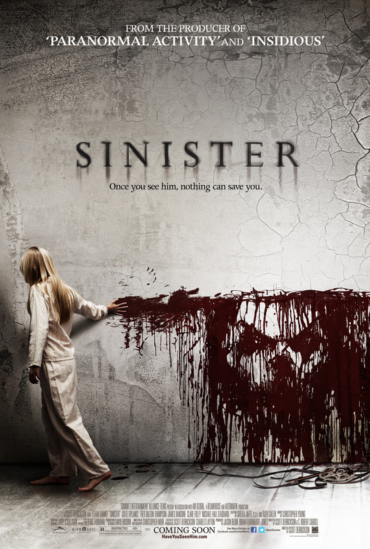
Sinister Poster
|
Sinister Trailer
|
Imagery
What we like about these products is how they used imagery as amazing branding. This works because the image of the face is so different that it stands out anywhere. For example in the poster you can see the face of the antagonist in the drop of blood on the wall, this face is also the main focus point in the trailer.
What we like about these products is how they used imagery as amazing branding. This works because the image of the face is so different that it stands out anywhere. For example in the poster you can see the face of the antagonist in the drop of blood on the wall, this face is also the main focus point in the trailer.
|
Sinister Trailer
|
Sinister Poster

|
Font
The font is the same on both products. The use of the drop shadow has really had a huge impact on the whole Sinister branding,
The font is the same on both products. The use of the drop shadow has really had a huge impact on the whole Sinister branding,
TEAM PANIC
|
Mazed Poster
|
Mazed Trailer
|
The font is the same within the poster and trailer, however the colour was changed. Even thought the colour changed it still has the same elements and still has that uniqueness about the font.
|
Mazed poster
|
Mazed trailer
|
We used the same Characters in the trailer for the poster, we felt like having the protagonist as the main image of the poster as we felt like people like seeing the last girl / protagonist more than seeing the antagonist.
Poster & Website
An example
|
Sinister Poster

|
Sinister Website
|
Imagery
Between the website and poster the imagery are used the same. For example the image in the background is the same in the website, its also the same colour.
Font
The font is the same, this is a great way to stay branded and to let everyone know that all the products belong together.
Colour Scheme
As you can see the colour scheme is kinda of the same within the poster and website. The light grey and dark red stands out as the main style for Sinister.
TEAM PANIC
|
Mazed Poster

|
Mazed Website

The banners on the website links with the poster as the banner on the website looks like a smaller version of the poster, we used the same image and text, font and colour scheme.
The background images was the main focus for our banner as its smaller so we wanted it to be compacted. |
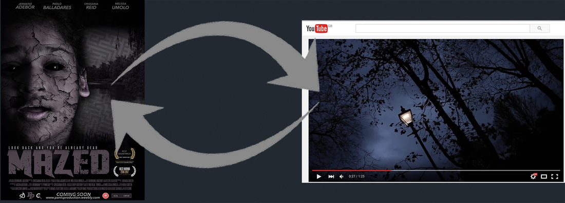
Magazine & Trailers
An example
|
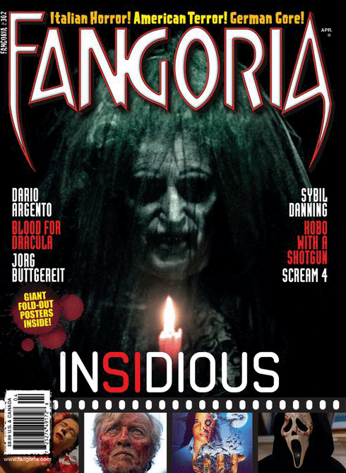
Fangoria Magazine
|
Insidious (2010) Trailer
Insidious used the unique antagonist in the film as a brand technique, you can see the antagonist in the poster is one of the main one in the films, also it pops in the trailer.
The colour scheme is still almost the same as they used lots of doll colours to have the effect of the protagonist dying out. |
TEAM PANIC
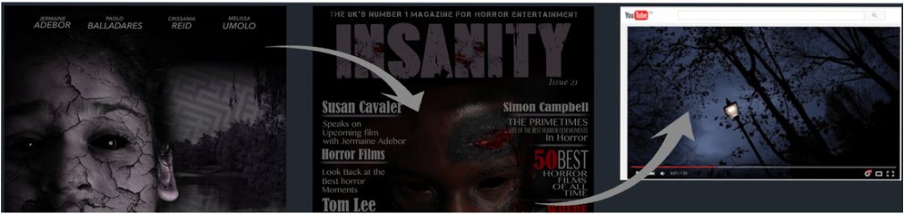
|
Mazed Magazine
|
Mazed Trailer
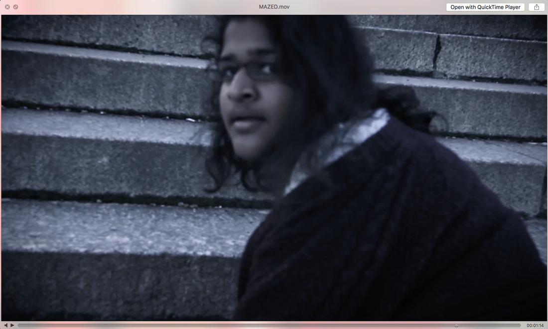
The magazine image and some shots on the trailer are similar. The reason we did this was so we can have an overall image for Mazed, every horror films has an antagonist that everyone remembers, so we tried to aim to have this effect with our trailer Mazed.
|
Magazine & Website
An example
|
Rue morgue Magazine
|
Psycho Magazine
|
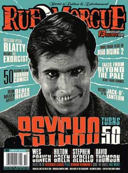
Imagery
Between the website and magazine of psycho the images used are basically the same. Both images are grey and both are images of the main antagonist of the film.
Font
The font is the same used different colour, because of the branding you are able to tell that its the same psycho company. This is very important as now they can use different colour and still have the same branding.
Characters
They used the same characters for both the magazine and website, by using images of just the main antagonist. This creates a face for psycho so now its not just text and such that will give it the brand.
TEAM PANIC
|
Mazed Magazine
|
Mazed Website
|
Font
We used the same kind of font between the website and the magazine. This was so people become more know with this font and stated to match them together with other Mazed products.
We used the same kind of font between the website and the magazine. This was so people become more know with this font and stated to match them together with other Mazed products.
LOGO
|
Panic Mini Logo

|
Panic Mini Logo

|

Panic Productions Banner
We kept the PP in all our logos so people will be able to remember that its our trademark. Keeping it red was the main aim as it stands out in any background. What we did was simple over lay the two p's and had on lower than the over on we then thought it will be cool to have a line and have the P.Ps in between the lines. This was just to give the logo an unique spin on it.
Brand Identity with in Logos
At the heart of a great business is a first class product or service and every business wants to be a customer’s ‘first choice’. Building and managing a brand can play a large part in making this happen and if you want to strengthen and manage the perceptions of your business, then a strong brand is needed. Good branding elevates and differentiates your like-for-like products or services and gives your customers reason to choose you over your competitors.
An example
|
Resident Evil Logo
|
Saw Logo
|
Silent Hill Logo
|
These companies make their logos easy to remember so when they only have 2-5 seconds of air time people will easily see and know the company,
TEAM PANIC
Title For Poster
This is the TITLE for our film called Mazed, with this we like the idea of having the text look almost broken and by using this font we felt we achieved this and also was able to give the text some uniqueness about it. The reason we used the colour purple was because we felt it was the colour of death and because this was a horror film we felt it ticked the horror boxes.
An example
|
Universal Logo
|
Paramount Logo
|
20th Century Fox Logo
|
These companies make their logos easy to remember so when they only have 2-5 seconds of air time people will easily see and know the company,
TEAM PANIC
This is the main logo for out media conglomerates team. This is how we started off our branding, when we made our logo we thought that using read will stand out more and we also wanted something that will be easy to remember. We also liked how compact it is, this made it easy to fit our logo in any product we make in the future, also because it simple it leave room to develop it in the up coming future.
|
This logo is for our distribution company, We wanted it to be simple but still look amazing we felt like we have captured it. We also like the was it looks like a signature.
|
Distribution Company Logo
|
Panic Logo
|
This is the media conglomerates mini logo Panic Productions. We liked the idea of having a mini logo so it can fit into places the huge main logo couldn't fit.
|
|
This is our sound company. By using the same colour scheme we used in the magazine we felt like it will become more remember and easy to know its part of the Panic Productions huge family.
|
Sound Company Logo
|
Advertising Our Brands
Advertising has served a critical purpose in the business world by enabling sellers to effectively compete with one another for the attention of buyers. You can't rely on a one-time announcement or word-of-mouth to keep customers buying your products. A strong commitment to advertising is as much an external call to action as it is an internal reinforcement to your sales team.
Here are some ways we our looking to promote our company and products.
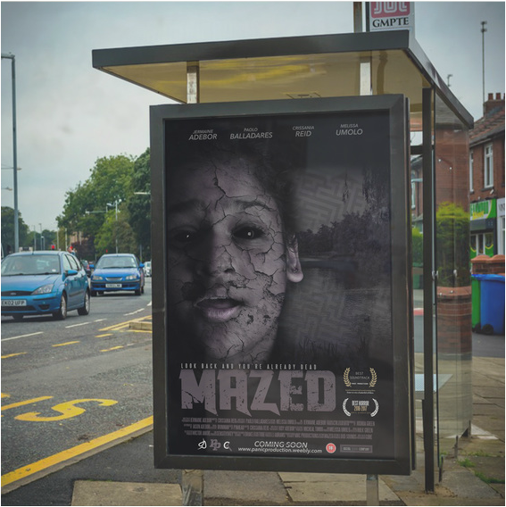
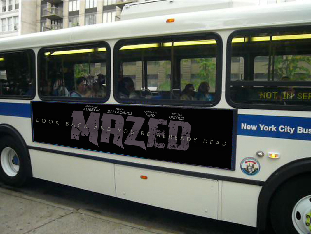
Mazed poster ads at bus stop
|
This is our film poster on a uk bus stop Like we said before promoting is very important, so the panic team was able to promote and push our product we try and used post ads, for example bus stops. just like the image on the left. This is a great way to promote items because over 1000 people will go to the bus stop and just sit there and wait so with out the knowing they will be looking at the film, so if they go cinema they will be like "hey I remember seeing this films poster somewhere before maybe i should go and watch it."
|
|
Another way ads and be posted is by billboards, this is another great way as they are normal big and noticeable from far so people all over can see it.
|
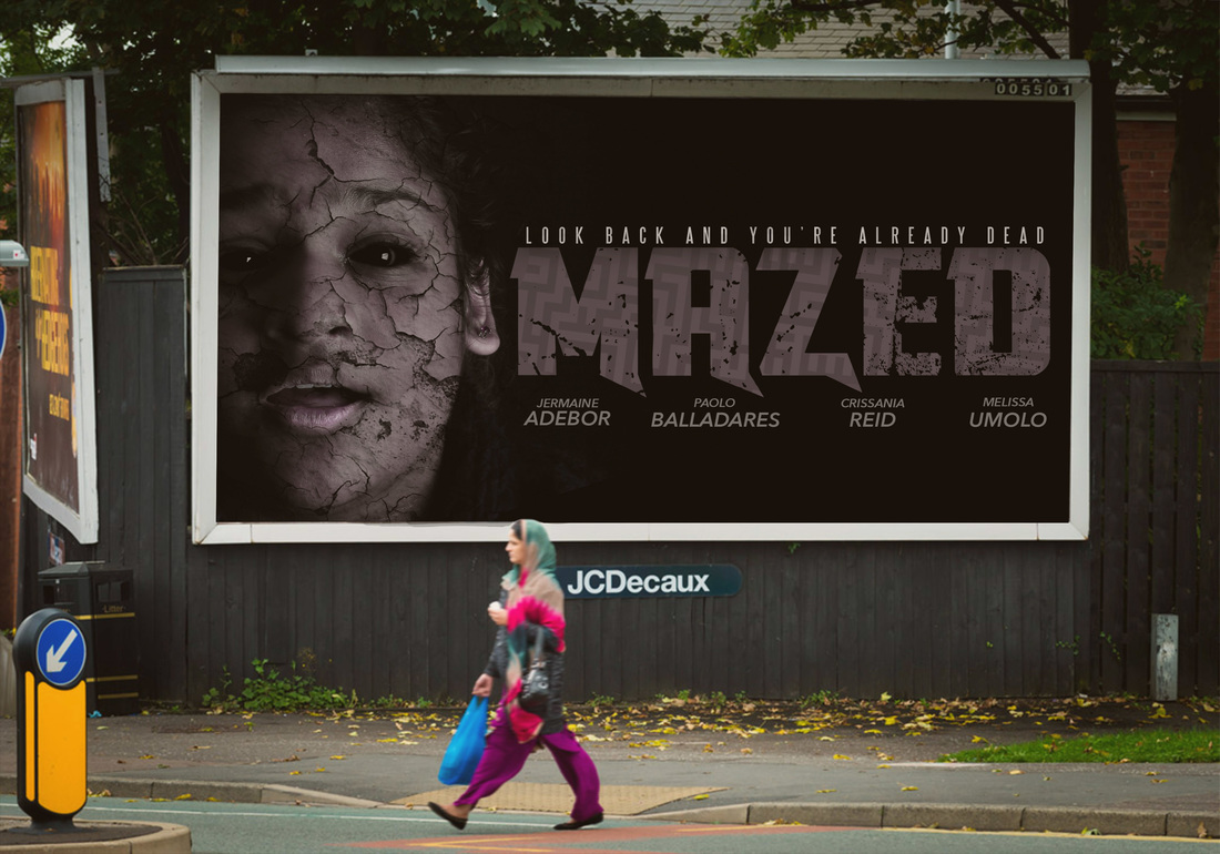
Mazed poster at billboard
|
|
|
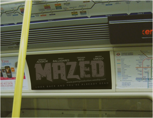
MAZED POSTER ADS UNDERGROUND / USA BANNER
As we want to get as much ads as possible we made lots of different banners and posters so if small space come were we can post our banners we are able to make do and still promote the films and our brand.
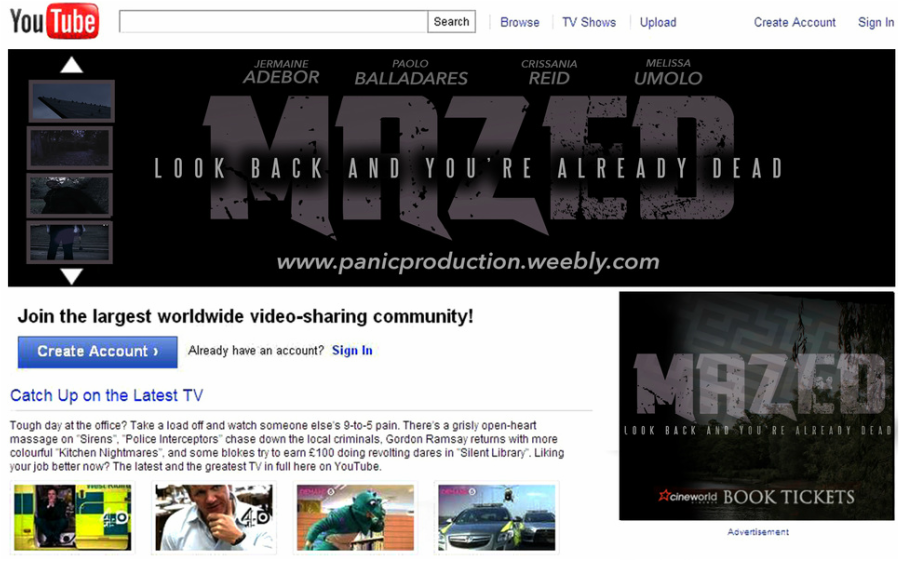
Another way we could promote our brand is by ads on YouTube. We would say that ads on YouTube will be the best and fastest way to promote something is because YouTube has over 1 Billion Active Users Each Month alone meaning all if not half of them will see our ads (the image above) and we will then become more know
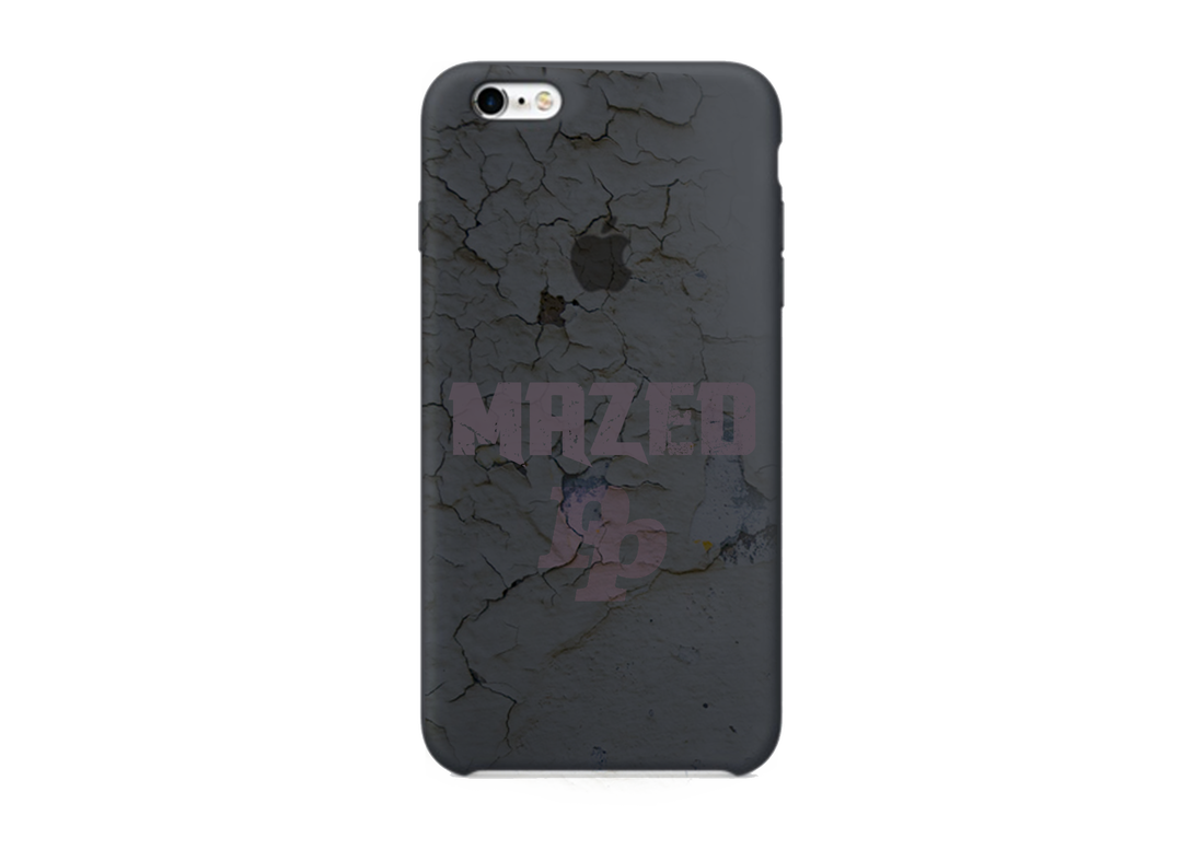
When doing research we found out that phone case can be used as a form of ads so we felt like we should design one to see how well it will turn out. How we kept our branding the same with this product was by keeping the same creaks the same and by using the same font and our colour scheme. What we like about this item is how well the colours link together
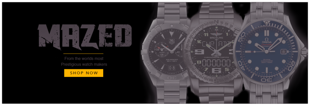
As we our trying to build a we felt like moving to items such as watches it will help build our company up more.
Just like other films they make popular items cases because they know lots of people will want it so by making the cases cheap people are more likely to get it and use it and it then becomes a promotion skill as people will see it and would see the films name and company logo
Like the saw company they made a game to promote the film so we thought that but bring a game out at the same time as the film it will boost each other
Google is a great way to promote anything as over a billion people use Google with in the space of a month. This means most of these people will see our images (test picture on top). However this will cost a LOT of money so we made sure to leave our link to our website so we can get the most of this advertisement
When we did our research we found out that music is the fast way to give out information so if we was going to have a soundtrack single it would be by drake and be put on Spotify just because thats were people go to listen the music nowadays so we had an idea that the song will do better on this platform
