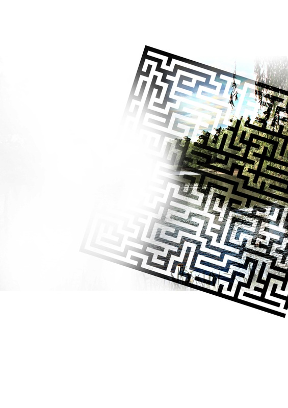
In this question, we will discuss what and how we used different types of media technologies in the construction, research, planning and evaluation stages of our film. Each section will be covered in detail with descriptions and examples of how we used programs/equipment. We tried and took advantage of most of the equipment that was available for us to use.
|
First and probably the most vital piece of equipment in our whole project was the Mac computer. The majority of all the work and editing was done on these computers. Even though the Mac's were ideal for the work we were to do, we had very little experience using them, so some time was lost learning the simple shortcuts and navigation tools. The Macs also came with programs and editing software for us to use like Adobe Premiere, After Effects, Final Cut Pro etc.
|

|
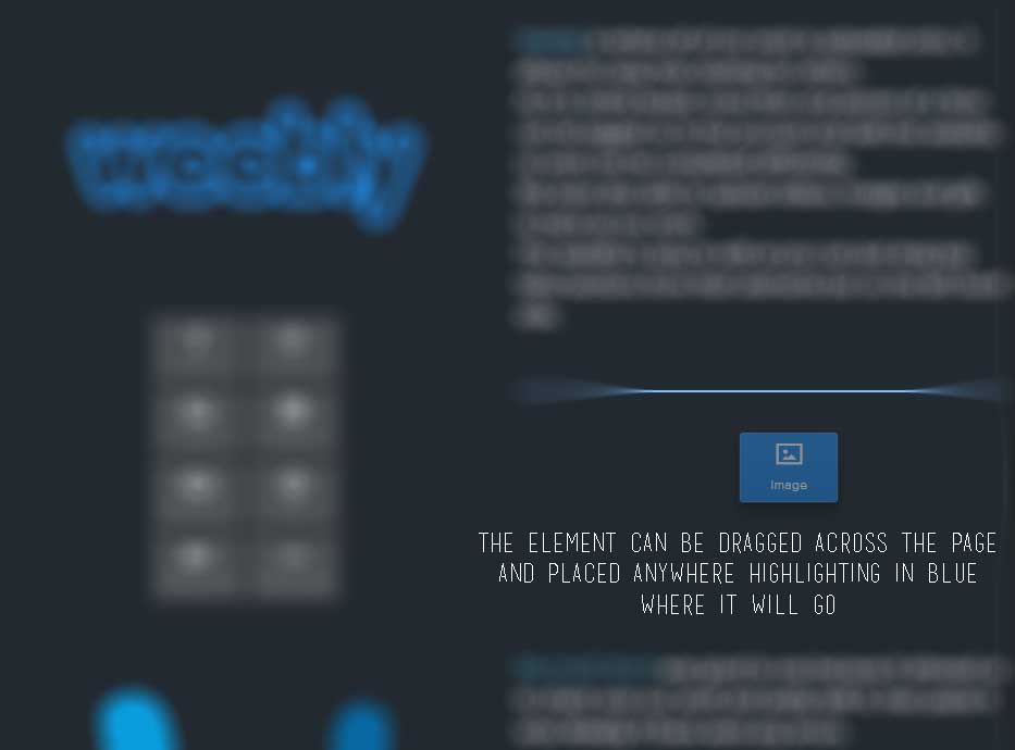
Weebly is where all of our work is uploaded onto, it allows for easy free viewing for others.
As it is online based, more than one person at a time can be logged on to the account and edit the website, so work can be completed efficiently. We were also able to upload videos, images and gifs to back up our work. The website is easy to edit as you can just drag key tabs/sections from their elements bar on the left hand side. 
The main ones we used were 'Title', 'Text' and 'Image' tabs as they were the key components of setting up our website. Other tabs like 'Spacer' and 'Divider' were also used to improve the layout of our pages.
|

|
Microsoft Word was good to use because it allowed us to check over our work and easily edit it, then paste it onto Weebly if there were any errors.
Microsoft Word was used in the textual analyses and research of the horror genre to type up the majority of the content. This was because it was easier to edit and go over what had been written than if it was directly put on Weebly from the start. |

|
Google plays a big part in today's society as it is the leading search engine in the world. We used it for a variety of reasons like finding relevant images for the work, especially in researching the horror genre and creating the concepts and treatments, and also searching for horror movies for inspiration.
It helped us understand and explore different sub-genres like 'J-Horror' and 'Psychological''. |
|
|

|
IMDb, or 'Internet Movie Database' is an online collection of movies, old and new. It offers a list of reviews and ratings of all the movies posted on it, so it makes it easy to find good movies to watch. It also provides additional information about the movie such as the release date, director of the movie and the initial cast. We used this site mainly in the Pre-Production stage to get inspiration for our posters for the Print Design section and for our Moodboard. It was also used in the Planning and Research for the Textual Analysis, it made it easy to find the actual posters for the movies and also gave a quick synopsis on what the film was about. 
|

|
Microsoft PowerPoint let us quickly create simple slideshows to present our ideas to different groups. PowerPoint also allowed for images and videos to be placed on any slide, the background could also be customized to suit the horror genre.
In the Planning and Research stage, it was used to create the presentations for our Concepts & Treatments, and also to create summary slides for The Horror Genre. In Pre-Production, we used PowerPoint for the Audience Research and Moodboards. This was because it was easy to separate the questions and display results and we were able to compile a collage of images for the Moodboards. 
|

|
WhatsApp is a messenger app on iPhones and Androids. We decided to use WhatsApp because it was easy to set up a group chat and we all had access to it.
We used the group chat to relay information to each other when we weren't in class. It also helped us figure out what things we needed help with. 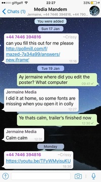
|

|
Dafont was the website where we got our custom fonts from. It's a site where people can share their font-styles from an easy to use platform where you can just download, unpack and install the font. This was great for us as there were a variety of different fonts to choose from in their different categories which suited our film.
|
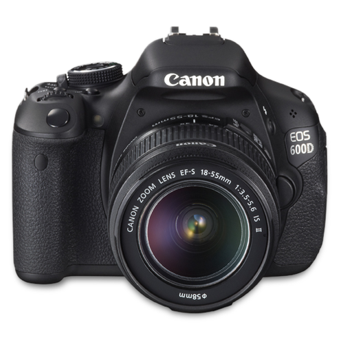
18 megapixel CMOS sensor
Full-HD EOS Movie 3.7 FPS continuous shooting Wide-area (9 focal points) 7.7cm screen |
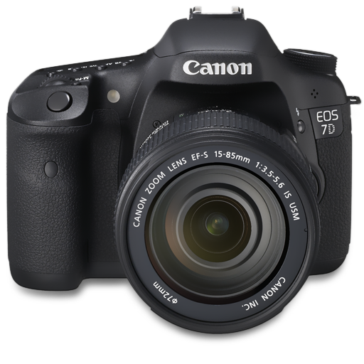
18 megapixel APS-C CMOS sensor
High ISO (6400) 8 FPS continuous shooting Full-HD movie Wide-area (19 focal points) Intelligent viewfinder Dual DIGIC 4 processors |
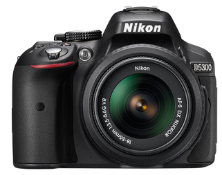
24.2 megapixel CMOS sensor
High ISO (12.8k extendable to 25.6k) 39 focal points 5 FPS continuous shooting Full HD 1080p movie High-quality audio EXPEED 4 |
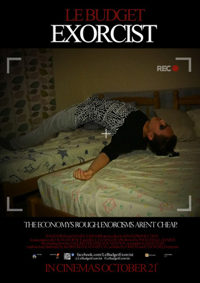
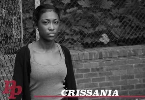
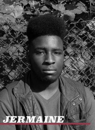
The Canon 600D and Canon 7D were used in the Planning and Research stage to take pictures of each of our team members and to take a group photo. The Nikon D5300 was used by one of our members to create his summer work which was of a movie poster for a comedy-horror called 'Le Budget Exorcist'.
|
|
|
The Canon 600D and Canon 7D were also used in the Production stage when practicing filming for the Camera Work section and to film the scenes in our trailer. The shooting process was fairly new to most of us as this was our first time filming things with an actual camera, so we had to get practice before shooting our trailer.
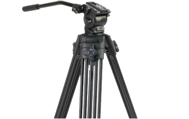
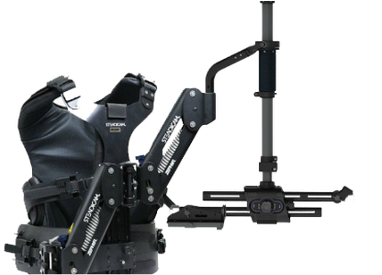
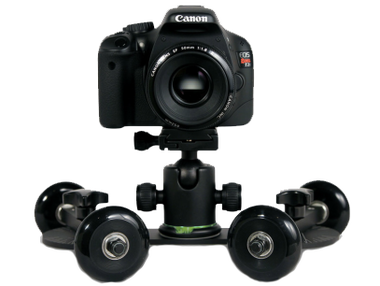
In this process we learned how to use the camera with equipment like a tripod, dolly & steady-cam.
In this process we learned how to use the camera with equipment like a tripod, dolly & steady-cam.
|
|
|
When filming the actual scenes, we were only able to make use of the tripod, shoulder rig and the dolly. With these pieces of equipment, we were able to get shots like panning shots, low-angle tracking shots and hand-help during chase scenes.
Our camera man decided to lower the ISO when filming some scenes in order to make it darker and eerier as at times, there was too much light and it didn't suit the vision we had.
Our camera man decided to lower the ISO when filming some scenes in order to make it darker and eerier as at times, there was too much light and it didn't suit the vision we had.
|
|
|
|
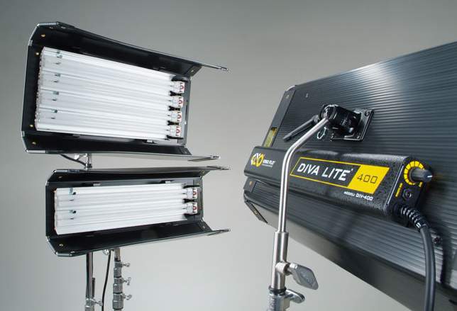
The Kino Flo Lights were only able to be used by us while we were in school, so it was not part of our trailer since we had limited baggage space in our shooting location. It was used mainly in filming our video logs and taking photos for our magazine and poster. The lights made it easy to control where the light was flowing into and how much light there was on a set.
|
Camera's for the Final Pieces
|
For our final pieces, we used the different cameras to take pictures and film our scenes.
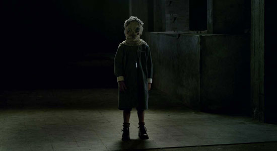
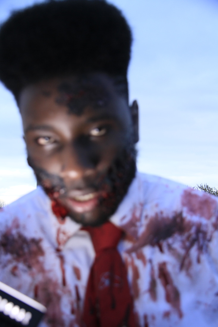
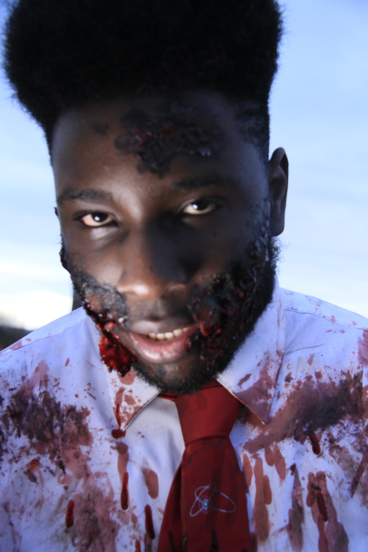
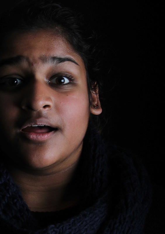
The image on the far left is an example of a bad photo for a poster/magazine. This is because the image is not in focus making it look unprofessional. This can be fixed by either holding down the shoot button on the camera if it is on automatic focus, or adjusting the lens if it is on manual focus. The one to the right is a much better image as it is in focus and shows the detail of the character. |
|
When filming the scenes, we configured the ISO and aperture to make the footage underexposed. We did this intentionally so that we could get a darker atmosphere from the start and work on any colour correction in post production. The video on the right is an example of this, we had the image we wanted from the start, so we only had to tweak it a little to get what we wanted.
|
|
|
The iPhone 5s & 6s were used in the development process as a means of communication, but also as a way to take high quality of images from outside of school when we did not have access to a camera or a scanner to upload our work with.
|

|
We used an EPSON scanner to create high resolution scans of some of our print work, so we had to use this to upload a high quality version of our treatment pages. We had trouble with managing the correct settings for the scanner as we did not have any experience with it before. This was piece of equipment was used to upload the Concepts & Treatments in the Planning and Research stage, the Storyboards & Print Design in Pre-Production and the Shooting Script & Location Recce in Production.
|
|
|


|
We used Social Media in our work mainly for the Audience Research part in our Pre-Production stage. We posted our questions on social media to get results from anyone in the world who viewed it, making it easier to get a variety of different results.
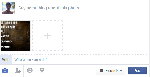
On websites like Facebook, you can attach images to your 'status' which people can view and answer in the comments section.
|

|
YouTube was our main source for finding movie trailers for inspiration. We followed channels such as WatchMojo & Movieclips Trailers to find the majority of our trailers.
We also had to upload our videos on YouTube in order to post them onto Weebly.
We also learned different ways of composing a trailer depending on the type of sub-genre that the horror film has. For example, a psychological horror will have more establishing and character narration in their trailers compared to a slasher/splatter horror.
|
Creating our logo was fairly simple as we wanted to have a simple, retro look to it, reminiscent of company logos in the 80s. We decided on having two P's with an old serif font to give it the look we wanted. Underneath it would be a dividing red line and the word 'panic' cutting it in half and 'productions' appearing underneath. The simplified version of our logo would just be the red line with 'PP' cutting it in the middle.

The process and skills used to make our team logo was fairly basic as it mainly consisted of text.
The main technique used when creating it was duplication,which was very simple to do. 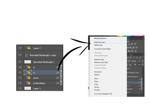
|
Photoshop was probably the most used program in our group combined, as it was used in a majority of the pieces of work that we created. It is well known for its editing capabilities allowing you to create virtually anything that you want providing you have the skills to do so.
Planning and ResearchIn the Planning and Research stage, we had to use Photoshop in order to edit most of the images on our team profiles and our team logo. This included adding filters/decreasing saturation to the team image (to make it black and white) and creating multiple layers to design our logo.
For the summer work, the poster for 'Le Budget Exorcist' was edited on photoshop in order to create the levitation image. Doing this was fairly simple to us as we all had experience using photoshop in the previous year. 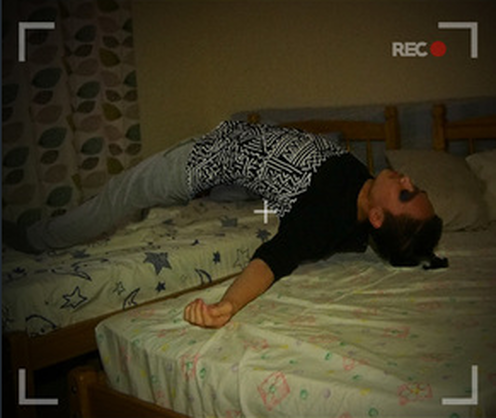
In this image, we had to combine two separate photos, one with the character in the bed and one with just the bed alone. These two images were blended together by using layer masks on the image with the character on the bed. This is so we could 'colour in' the character onto the bed while leaving the chair our of the picture, thus resulting in a levitating person. Creating the outline rectangles to replicate an old-school camera was simple was you could create shapes on photoshop and duplicate them. You could also rotate them accurately by typing in the amount of degrees you want it to turn.
A small app on the iphone called 'Aviary' also helped us in editing some images as it was much easier to use than Photoshop. With this app, we were able to easily decrease the saturation of colours in our team profile images so it would have a black and white effect. Gmail was used to send the images to our computers
|

PRE-PRODUCTION
|
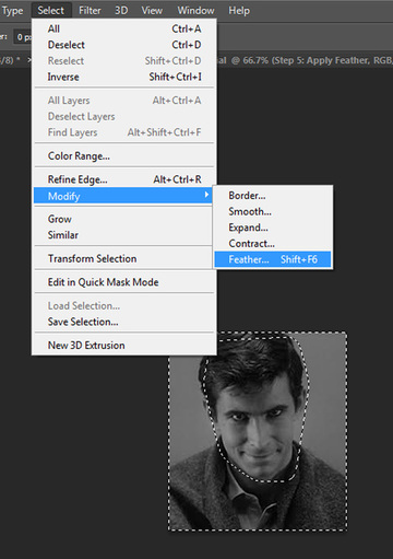
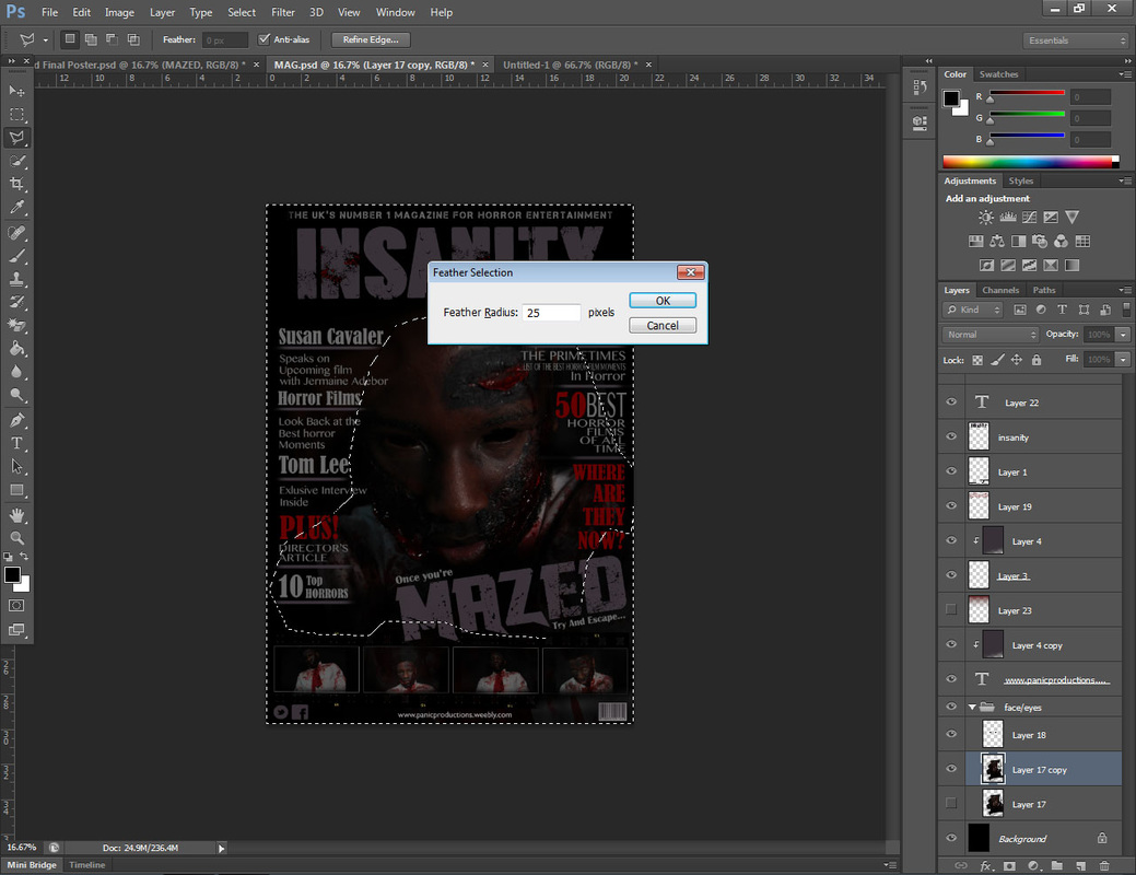
We used Photoshop in the Pre-Production stage to help design our moodboards. It was mainly used so we could 'feather' some of the images in order to allow them to blend together. This was a method we were familiar with as we did the same in our previous works. The images provide a simple guide on how to feather an image.
This method was used for multiple images in the moodboards 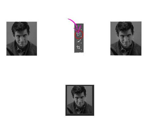
|
|
|
|
Drafting
|
|
|
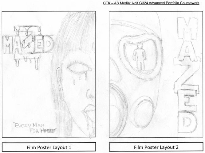
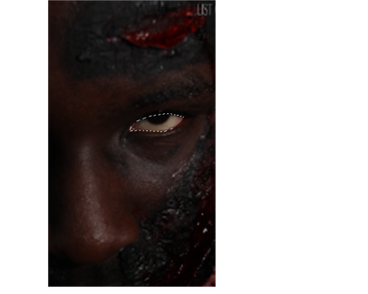
We were given the task to create different templates for what our magazine and our poster would look like and we came up with these ideas. The magazine was fairly simple and familiar to construct as we had plenty of experience making them in the first year, however some conventions changed as the genre of the magazine was Horror. As with the poster, it became fairly simple on how we wanted to have the layout look like as we all had a rough idea of what horror posters consisted of.
Final Pieces
Using Photoshop was vital when creating our final pieces as we needed it to create and edit our magazine and movie poster.
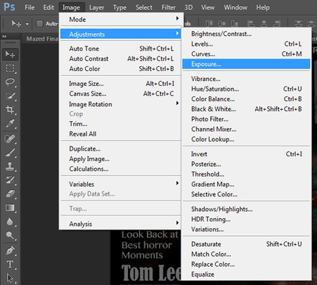
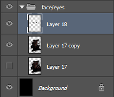
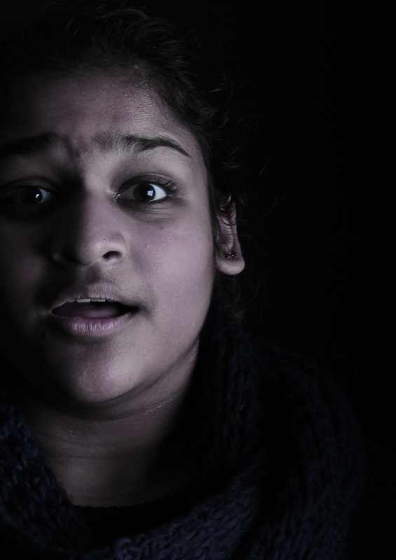
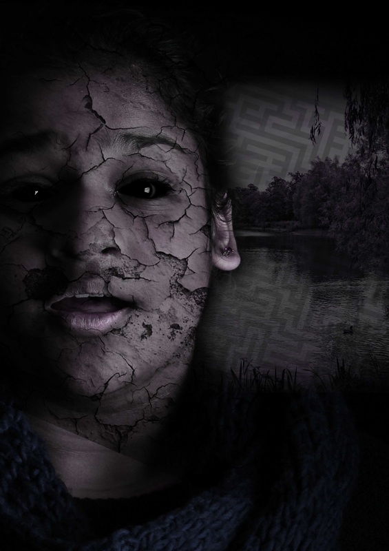
The MagazineAs our main image for the magazine was our antagonist, we had to somewhat conceal his identity. We ended up decreasing the exposure levels on the image.
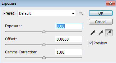
Again, the 'lasso' tool was used for this project to blacken the eyes of the antagonist. Using the lasso tool to close off the eyes of the antagonist allowed us to colour it in black without having to worry about drawing on the face of the character and potentially ruin the image.
|
The 'feather' tool was also used to crop out the rest of the background in the image. We did this to create the illusion that the character was emerging from the darkness and so we feathered the majority of his clothes while still leaving parts in that contained blood and making most of his face (except hair) visible.
|
Font Choice
|
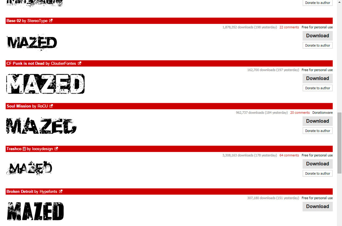
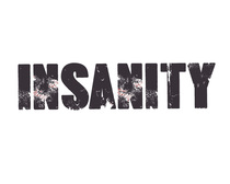
We got the majority of the stylized fonts from DaFont.com. As we wanted to continue the theme of destruction and the post-apocalyptic atmosphere we aimed for in our trailer, we went on the 'destroyed' section of the website and looked for fonts there. It had a feature where you could preview words so we took advantage and typed in our movie title to see which suited it the most.
|
We decided to use a simple and similar font style for our masthead which looked close to our movie title font. This was because we understood that the magazine is not owned by the movie company and so they will retain their individuality despite the movie they are featuring. With this in mind, we still edited the font and used a scattered brush on Photoshop to add red spots, hoping to replicate scarred, dried blood.
|
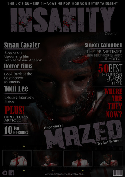
The PosterFor our poster, we had to create an image that gives out the general story and atmosphere of our movie and still keep key themes unknown.
First we added a blue tint to the image by getting a plain blue layer over the main image and lowering its opacity so it doesn't block out the image. This was because the colour of the main image was too vibrant, and we wanted it to have a colour shade connoting death and coldness.
|
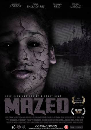
For the final poster, we decided to combine our first and second templates as we felt it would be best with our layout.
To add the cracks on the faces, we took a random crack template from Google. We then copied multiple layers of this template to make it appear thicker and also so that we could edit separate layers and add different effects to them. One layer controlled the saturation of the cracks, which helped emphasise the blue tint to the face. The others were reduced in opacity to and moved around slightly to cover more area of the face and add some depth to the cracks. The same method was used to blacken the eyes as the method used in the magazine. |
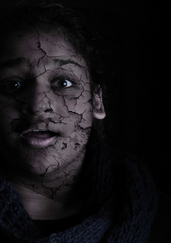
The images in the background were simple to edit into the poster. All we had to do was reduce the opacity of the layers and erase any of the image that went over the face of the protagonist. As the image was already barely visible, there was no need for us to reduce its saturation to make it black and white, especially because the rest of the image is already dark enough, the opacity allows it to blend in with the colours.
|
|
|
|
|
We also wanted to have continuity with our magazine so we used the same font for the movie title.
|
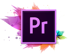
Premiere was mainly used in the pre production and production stage of our coursework. We first used it when making the animatic of our trailer which had the trailer of 'The Purge: Anarchy' as its template.
|
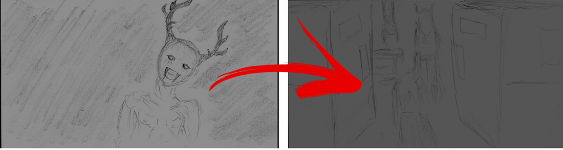
When starting to create the animatic, we began with using scanned images of our storyboard that had been drawn out and imported them onto Premiere. From this, we could start making 'sequences' by dragging the imported files onto the sequence board.
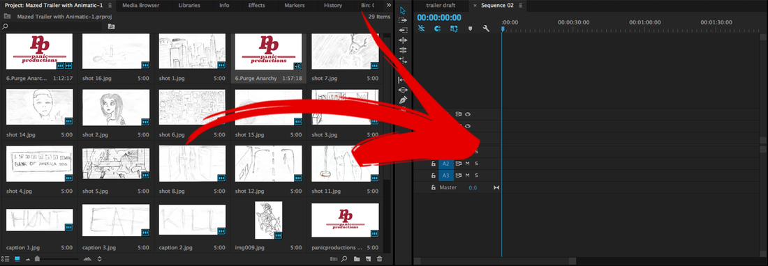
As we had a trailer already for our audio, we didn't have to add any of our sounds yet, so all we had to do was match the images and edit them to suit the sounds that were being played during the trailer.


|
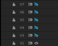
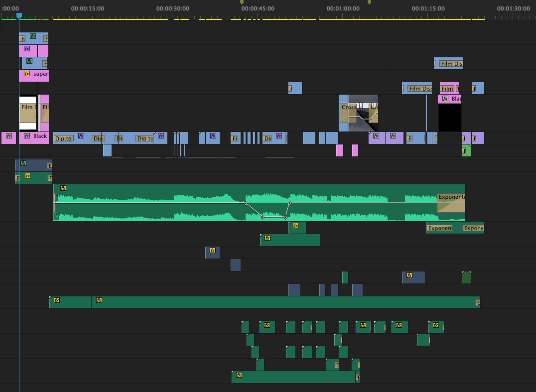
The image above shows how we managed to achieve the flickering effect in our animatic to match the sounds at that time. Using the 'C' key on Premiere (shortcut for 'cut'), we cut up the footage while zoomed in on the layer as this gives us a longer timeframe to work with, so we could fit in around 9 flicks in 1 second. Once we had the parts cut out, we took each other block onto a separate layer which we made invisible, so we wouldn't see those blocks when watching the footage.
|
|
|
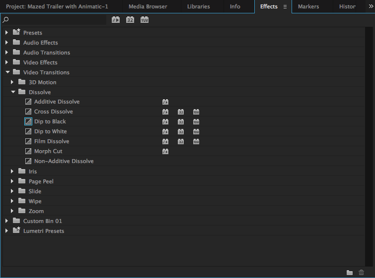
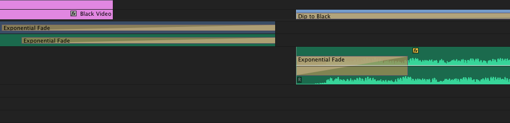
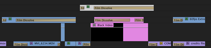
As it was our first time using the program, we didn't know what we could really do with the effects, so we mainly experimented with the transition effects, mainly 'dip to black', 'dip to white' and 'film dissolve'. We did this to make the transitions between cuts smoother so it didn't appear jumpy and sudden. We also did it so that it wen't better with the tempo of the audio from our template. We used the 'dip to black' as a sort of 'cross dissolve', so it dipped to black and emerges with a separate scene as shown in the image below.
|

THE TRAILER
|
Creating the trailer was much harder and complex than creating the animatic. This was because we had a lot more layers to work with and we had lots of different sounds that we had to make sure was in sync with each other for it to sound and appear complete.
We used an effect called 'exponential fade' on both the footage and audio. This was so that they both mutually fade out and gradually ease in onto the next sound clip without making it feel jumpy as that was not the atmosphere we wanted.
|
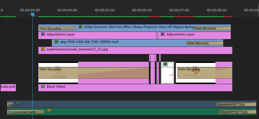
The footage that was mainly heavily edited were the footage for the introduction showing the company logo and footage towards the end where things got more intense. We wanted to give our company logo a horror-look, so we wanted to use an old grainy film filter and layered it above the original image. We also used some distortion effects that made the image shaky. We added some quick zooms on the adjustment layers to make it look like the logo was pulsing.
|
|
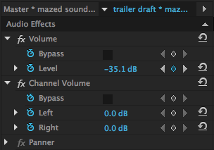
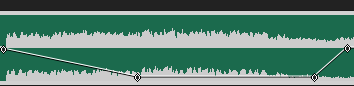
We used a tab specifically for audio effects to control the different sound effects that we wanted to have in the trailer. A key scene where the antagonist drops the hammer, we wanted the audio to drop down in decibels to add more gravity to the scene. We achieved this by adding time stamps to where the decibels would start decreasing and where it would go back to normal levels again.
The time stamps were also used for the video footage where slow motion was used, then speeds up again. |
|
|
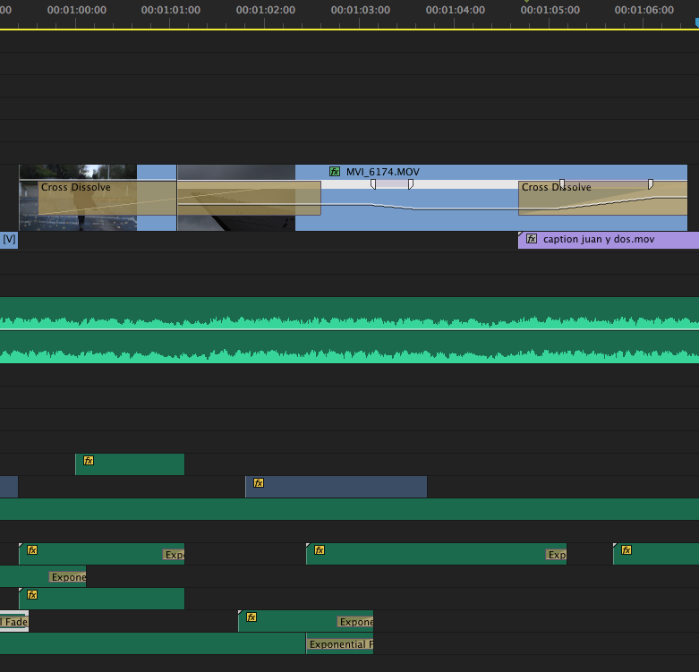
We wanted to experiment more with what we could do with the combination of different transition effects and audio files we had access to. So, in one of the scenes, we tried to use a cross dissolve between two separate scenes, and another cross dissolve to lead into the captions. The first cross dissolve was followed by a slowed down footage of birds flying away. This was then accompanied by a drop in the audio (in terms of tempo and pitch) to make it more dramatic as it then led into the captions.
|
|
Towards the end of our trailer, we decided to mimic the effects that was used in the beginning to show a connection between the start and end. So we reused the old grainy film filter but tinted it to blue to match the title of the movie and so it was somewhat more subtle. The credits of our movie was created from Final Cut Pro, we used a template that was available there and imported the file to Premiere, which was then edited to give the filtered look.
|
|
To conclude, though we were limited in our knowledge of how to use most of the programs that we had to work on and had to learn on the way, it was a fairly good experience and we believe that the work we produced was at a good standard. The internet was of great help to us in order to understand what to do and how to do specific things. Although Weebly was sometimes buggy and difficult to edit, it offered the necessities and it did it well. This project allowed us to work well as a team and overcome the problems we came across through the use of digital technologies.
