In What Ways Does Your Media Production Use, Development or Challenge Forms & Conventions of Real Media Products?
What are Conventions
Conventions of real media products are rules and ways that make the media products what they are. These rules are what makes a trailer a trailer that viewers are familiar with, a film magazine a normal film magazine to readers and a film poster a successful film poster for the audience it's meant for.
Audience will decide whether they want to consume the media products or not by recognizing the products through the type of genre.
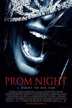
Below we looked at some existing horror film posters, magazines and trailers. By doing this we can examine the different themes and layouts that are shown. With these media products are our horror poster, magazine and trailer. which we also tried to see the patterns and trends found in them that were similar to the existing ones.
Audience will decide whether they want to consume the media products or not by recognizing the products through the type of genre.
Below we looked at some existing horror film posters, magazines and trailers. By doing this we can examine the different themes and layouts that are shown. With these media products are our horror poster, magazine and trailer. which we also tried to see the patterns and trends found in them that were similar to the existing ones.
The Conventions of the FILM TRAILER:
Lighting Pacing Plot Composition
Props Setting Storyline Camera Techniques
Editing Music Length Tension/Suspense
Sound Effects Characters Costumes
Props Setting Storyline Camera Techniques
Editing Music Length Tension/Suspense
Sound Effects Characters Costumes
The Conventions of the FILM MAGAZINE FRONT COVER:
Subject/Characters Main Cover-line Puff Cover-lines
Dateline QR Code Strap-lines Social Media Links
Website Barcode Price Celluloid Film Strip
Dateline QR Code Strap-lines Social Media Links
Website Barcode Price Celluloid Film Strip
The Conventions of the FILM POSTER:
Credits Website Review Quotes
Company Tagline Coming Soon/Release Date
Film Title Subject/Imagery Festival Awards/Nominations
Logos Actors names
Company Tagline Coming Soon/Release Date
Film Title Subject/Imagery Festival Awards/Nominations
Logos Actors names
Social Media Used
These were the social networks we used to get feedback from the audience. Getting feedback is important because it allows for us to see how we did with trailer, magazine and poster. Things that went well and things that could have improved. A few of these social medias are visible on our film magazine.

|

|

|

|
POSTER CONVENTIONS
Convention 1 - The Eye
|
|
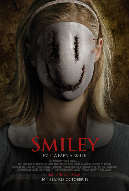
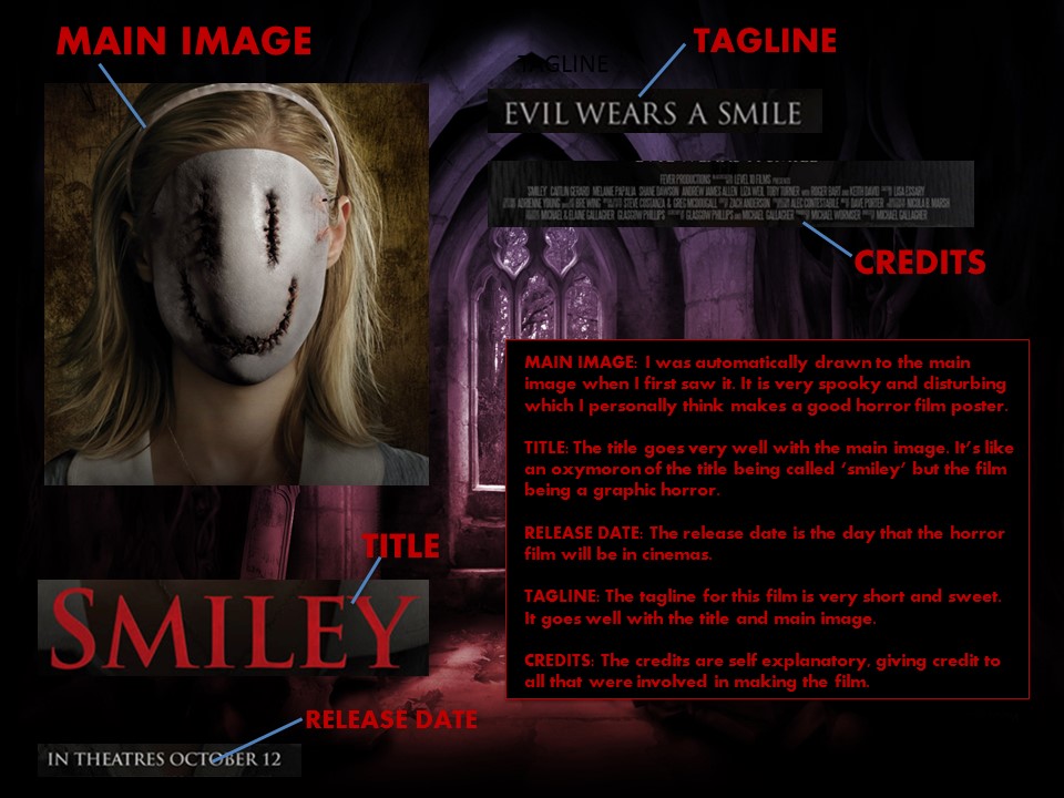
Overall the Smiley poster is very out there and looks appealing to go and watch. I like how it looks like a child is the one wearing a smile engraved mask with blood.
|
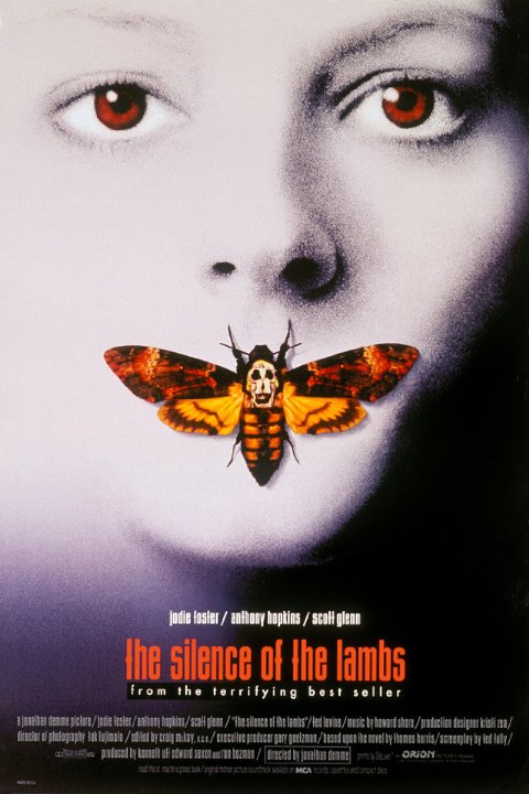
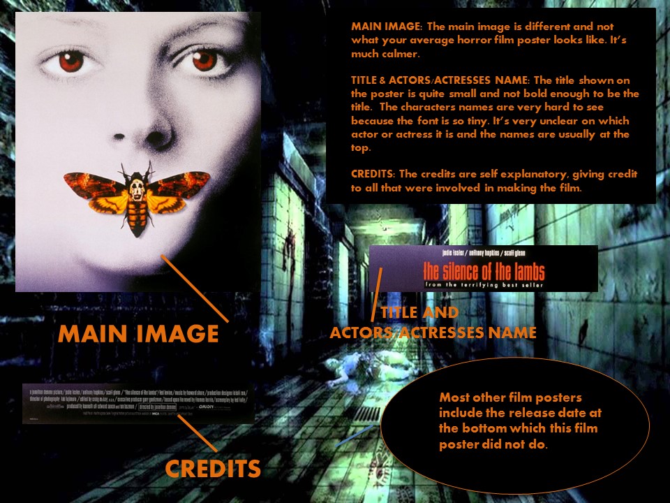
Convention 2 - The Silence of the Lambs
|
|
The silence of the lambs is overall did not have some of the conventions needed to make a popular horror magazine poster that can be noticed as a great one.
|
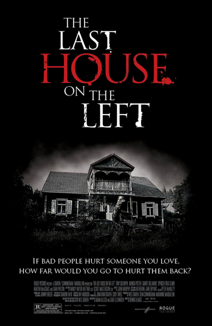
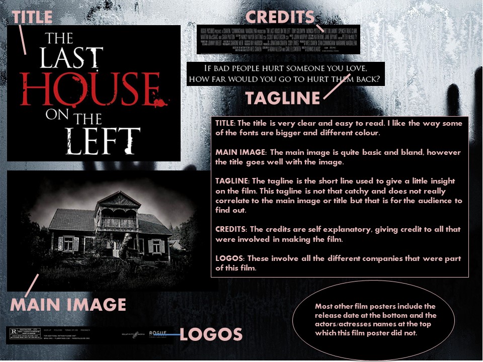
Convention 3 - The last house on the left
|
|
The last house on the left is overall simple horror poster. The title of the film takes up more space on the poster then the main image. This is not that great of a good idea if both the title and the main image is quite basic. With this poster there is nothing that draws you to it straight away. This would be acceptable if the star power is strong but the characters names are not shown on the trailer which makes it harder for people to make a judgment on whether to watch or not.
|
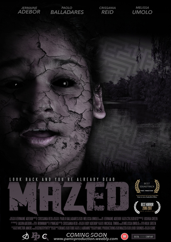
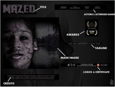
Convention 4 - MAZED
|
|
MAIN IMAGE: The main image for our poster is very relevant to the title with the maze on the side of the girl’s face. It doesn’t look too average and the typical horror film poster with blood everywhere.TITLE: The title goes well with the side image of the maze. It’s also very bold font wise however changing the colour of it would have made it more eye catching. LOGOS & CERTIFICATE: These involve all the different companies that were part of this film. The certificate is to show from what age the film is suitable for. CREDITS: The credits are self explanatory, giving credit to all that were involved in making the film.TAGLINE: The tagline is not too long and makes the person viewing this poster think and want to see what the tagline actually means.
CAST: The actors and actresses names are clearly shown at the top of the poster which makes the poster look professional. |
Conventions FOLLOWED in the film poster:The conventions followed on the film poster were the actors names which is using displayed at the top of the poster, we also followed the use of credits which is usually displayed by at the bottom of the poster. We also decided to have coming soon instead of the release date which also is usually at the bottom of the poster.
|
|
MAGAZINE CONVENTIONS
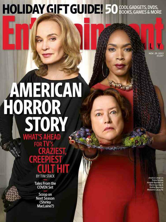
Convention 1 - Entertainment Magazine
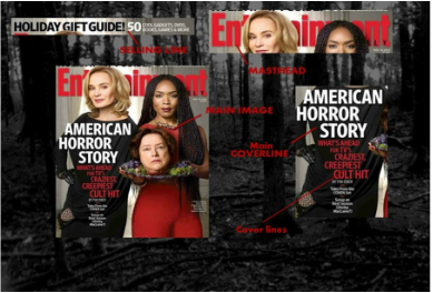
|
This film magazine followed the conventions that make it recognizable to the audience. This real media text include a main image which some of the audience is familiar with as it is from the TV show American horror story, the main cover line shows that. A lot of magazines in horror have puffs (extra images on the side). This film poster looks much more sophisticated as the main image is enough to be inviting to a reader. Another conventions that was not followed was the price, barcode and social media links. These conventions are somewhat vital when with a magazine as it makes it easier for the reader know more.
|
|
|
Convention 2 - Empire Magazine
|
|
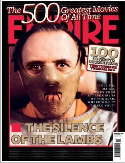
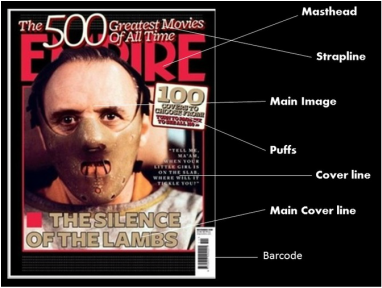
This film magazine is a lot older than the others shown so it's most likely to follow the conventions of a magazine. The main coverline can give a away where the main image is coming from.
|
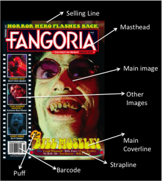
Convention 3 - Fangora Magazine
|
|
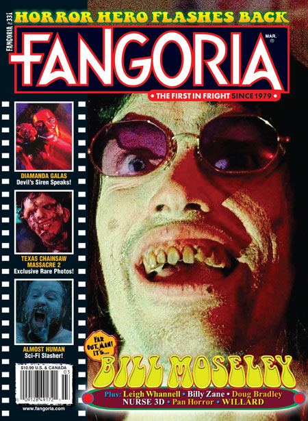
This horror magazine followed the conventions in making this a recognisable magazine. It has a barcode which every magazine should have for it to look as professional as possible. There are other images inside camera film which shows other horror films. This makes the magazine look like every other horror magazine but this magazine is quite old so it may have been original then.
|
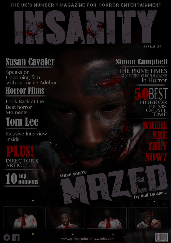
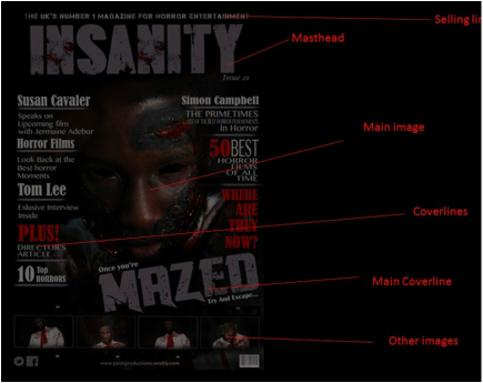
Convention 4 - Mazed
|
This was the magazine cover that we did as our final product. Overall the magazine cover looks very clean cut. It looks more like a real horror magazine cover then a media student on with lot's text and images bombarding the cover. I like the extra images we added at the bottom of the magazine cover because it was something we saw on almost everyone's magazine cover but I feel ours is much more unique. However I do think that the magazine cover is quite dull, mostly because of the colour scheme we chose as most horror films are quite bright and ours looks quite sophisticated for a horror magazine. I think we should have added a pop of colour somewhere whether it be the masthead of the coverline.
|
|
|
Conventions FOLLOWED in the Magazine Front Cover: |
Conventions DEVELOPED in film magazine: |
Conventions CHALLENGED in film magazine: |
|
The subject of the front cover is a close up shot of the antagonist's NVC connoting anger. The price of the magazine is £1.99 and this is reasonable for a horror magazine. We followed the convention of having a barcode as it allowed for the magazine to show that it's more professional. The website was a convention we followed because it was just a small detail that would be essential for the magazine cover. We also added our company logo panic production for logo to be known and coverlines and main coverlines to give it more of a real horror magazine instead of it looking like a media project.
|
We added the conventions of a film magazine but did not develop it as much as we would have hoped to. We were just too focused on making it look professional that we didn't have the time to add touches of originality. If we had developed the film magazine front cover I think we should have changed the colour scheme. It was too sophisticated for a horror film magazine front cover but we had to make the colours the same as the poster to known that they relate to each over. We could have added a pop of colour somewhere whether it be the masthead or the coverlines, there was only the small bits of blood that are splattered in the masthead.
|
Our film magazine did not really challenge conventions as much as we should have. We just followed the conventions however there are ways we should have challenged the conventions. W should have put both the antagonist and protagonist on the magazine similar to the real media text of American Horror Story. This hopefully would have given more information on the trailer and maybe engage more people to wonder what happens to them.
|
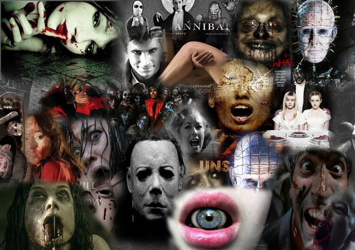
HORROR FILM INSPIRATION
Posters with Props
|
|
|
|
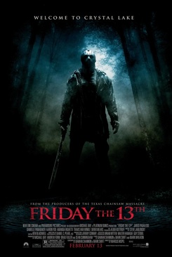
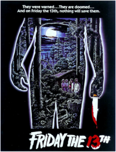
These conventions involve props and these props. From these posters it's not hard to tell that these props are a main factor of the film. The prop can have a lot of meaning and in a horror film the prop can usually be a weapon. The prop is part of the poster to show how much relevance it has the film, for example Friday the 13th. I added both the 1980 and 2009 poster. In both the antagonist is visible holding a machete/knife. This connects to the fact that he kills teens with that weapon.
In our film poster we decided to not add a weapon as not only did our audience chose the close up shot of the antagonist but we wanted the audience to just focus on him and no other prop.
In our film poster we decided to not add a weapon as not only did our audience chose the close up shot of the antagonist but we wanted the audience to just focus on him and no other prop.
TRAILER CONVENTIONS
Trailer Convention 1Scream |
Trailer Convention 2Blair Witch Project |
|
The conventions in this trailer starts off with a caption.The cation is not a short witty one but just telling us about how this whole documentary, trailer came about. This trailer was very calm and known as the equilibrium of the whole situation. Then the tempo of the music starts to go up and it begins to get faster, especially when they are running. This was all shot hand held which makes it more realist for us as the audience.
|
This trailer has all the general conventions that are needed for the magazine trailer. At first it's quite calm then the music in the background gets faster. The music gets much faster and the captions begin to get very gripping. The trailer also had an easy plot to follow as we can see todorov's theory in the trailer.
|
Trailer Convention 3
MAZED
|
|
Overall we managed to follow the conventions that make a horror trailer. The lighting was natural light as we filmed in Crystal palace Park. It made it easier to make our trailer stand out from the others. The length of the trailer is around the length of under 2 minutes and does cover a lot within it. There is plot that is easy to follow in it as it is clear that the antagonist was someone who was once someone important before he became evil and ended up chasing the protagonist.
|
The conventions that we followed in our trailer were the props. (the hammer that the antagonist used to fill the stock characters). Tension/suspense (when the antagonist is running after the antagonist and might have c aught her at the end), pacing (when the protagonist was running away from the antagonist. Another convention was the sound effect was of the protagonist breathing heavily) and the convention we followed was camera techniques, we decided to give a more realistic feel. We followed the costume convention in the trailer with the antagonist as he was wearing a shirt with blood on it. The usual length of a trailer is about 1-2 minutes and our trailer followed the convention as it was 1 minute and 24 seconds long, very reasonable.
|
Conventions DEVELOPED in the trailer: |
|
|
The conventions followed in our film poster were the actors names which is wrong displayed at the top of the poster, we also followed the use of credits which is usually displayed by at he bottom of the poster. We also decided to have coming soon instead of a release date which also is usually at the bottom of the poster. The subject on the poster is the image of the protagonist looking scared and worried.
|
We developed the setting of the conventions. Usual conventions of a setting would be in a dark haunted house or a dark room, but we developed this convention by deciding to have the setting outside in the daylight. We challenged the conventions of the characters is that we focused on the antagonists and protagonist without giving some more cameos for stock characters which most trailer include.
|
One of the conventions we challenged was the lighting. Usual conventions of a horror trailer would be dark and gloomy. The convention we followed for lighting was natural daylight. This allows for the trailer to not be clique and have some originality. Compared to other trailer our one stood out for that reason.
|
SUB-GENRE MOODBOARD - THRILLER
|
This moodboard consists of everything that can be involved and be related to our sub-genre which is thriller with a theme based on survival. Our tagline is 'Every Man For Himself' meaning survival of he fittest. At first I thought the sub-genre should be slasher but that was because most interesting horror films are slasher which seems easy to film too. However I looked over everything and thriller fit the theme of the film more.
|
|
Psycho is one of the most well-known thriller films of all time. Even without watching the trailer most people would know the most iconic scene from this thriller was the scene where the protagonist was in the shower and was attacked by a knife with the antagonist. The conventions of this trailer are the sound effects, storyline, characters, length and tension/suspense. However it has challenged a convention by having a narrator and it's in black and white which is understandable as it was filmed in the 60s.
|
The Visit is a recent thriller film. The trailer packs a lot of information in under two minutes. It draws the audience to recognize that it is a horror film trailer. There was suspense/tension in the parts where the children always catching their grandparents doing unusual things, there is a clear plot that can be followed throughout, there are props, music and sound effects.
|
Make-Up
|
|
|
|
|
|
|
|
|
|
|
|
|
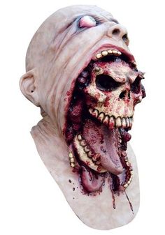
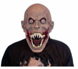
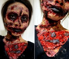
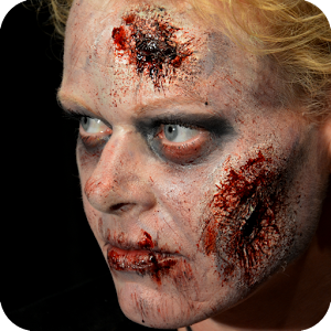
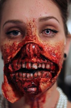
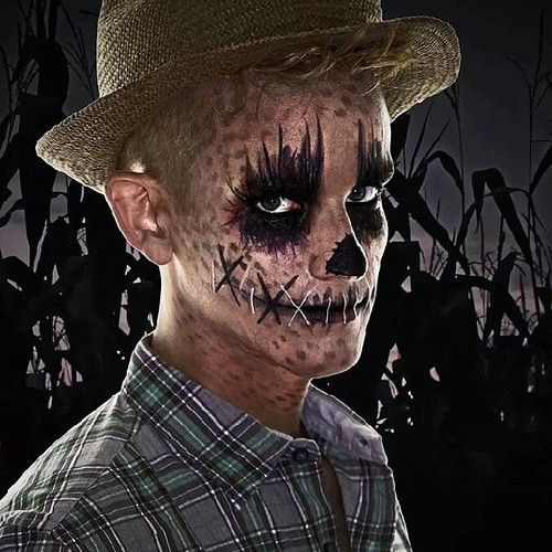
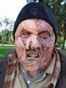
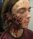
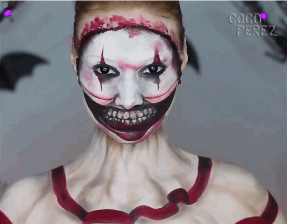
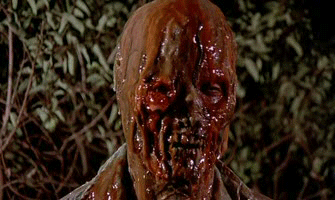
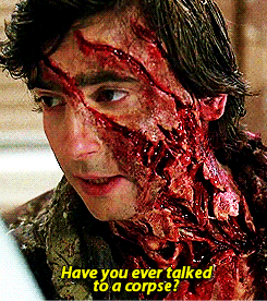
Here are some make-up inspiration that we took into consideration when making the antagonist's look. We wanted our antagonist to go well with the sub-genre as the make-up can always just fall into the splatter sub-genre. In looking at these make-up looks into consideration we had to make sure that the make up would blend well on darker skin as our antagonist was black.
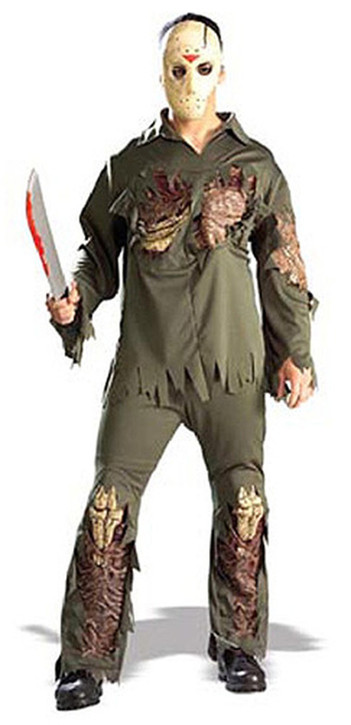
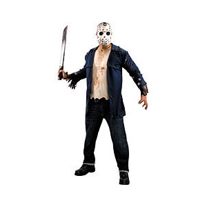
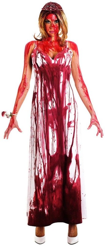
Costumes
|
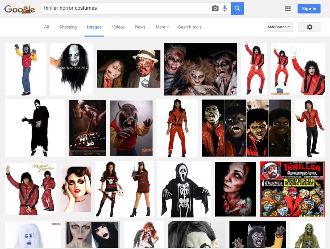
Doing the sub-genre of thriller it's not shocking that most of the time when you type thriller at all in google it will come up with Michael Jackson's thriller. These were the results that I got when I typed in thriller horror costumes. Other than Michael Jackson there are some reasonable costumes but not what we would particularly pick for our film trailer.
|
|
|